Welcome back to our blog series on creating movement with fabric art. Last week we talked about the principles of creating motion in fabric art. We also talked about why we have to have movement in order for it to be fabric art (as opposed to a traditional quilt).
I hope that I’ve been helpful in opening your eyes to one of my favorite things.
And I also hope that you’re feeling encouraged and excited about starting to create movement with fabric art.
As I mentioned in my last blog, there are three necessary elements to create movement – fabric, thread, and accessories. With those three simple, beautiful items, you can make any item flow, move, and bewitch the eye.
These fabrics are your canvas, your brushes, and your paints. Enjoy!
This week, I want to talk about using the biggest of those three mediums: fabric.
Creating Movement with Fabric
This is the biggest choice you have to make for any project – because it’s the biggest part. It also sets the tone:
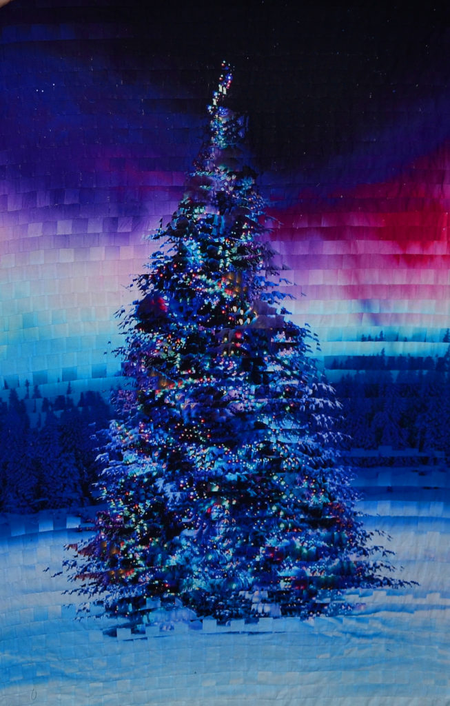
- Dark and broody…
- Light and sunny…
- Day or night…
- What century…
- Fun and whimsical…
- Beautiful and inspirational…
- Etc.
Creating Movement with Fabric – Colors
Color choice is everything in fabric art.
This goes for your thread and accessories as well, of course, but the fabric is the determining factor – always.
Movement in fabric is dictated by:
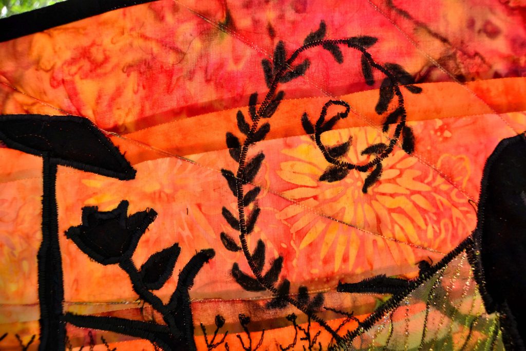
- The colors you use
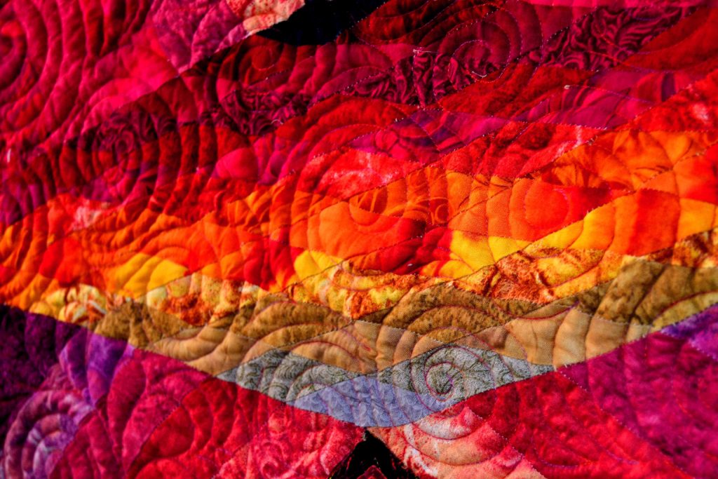
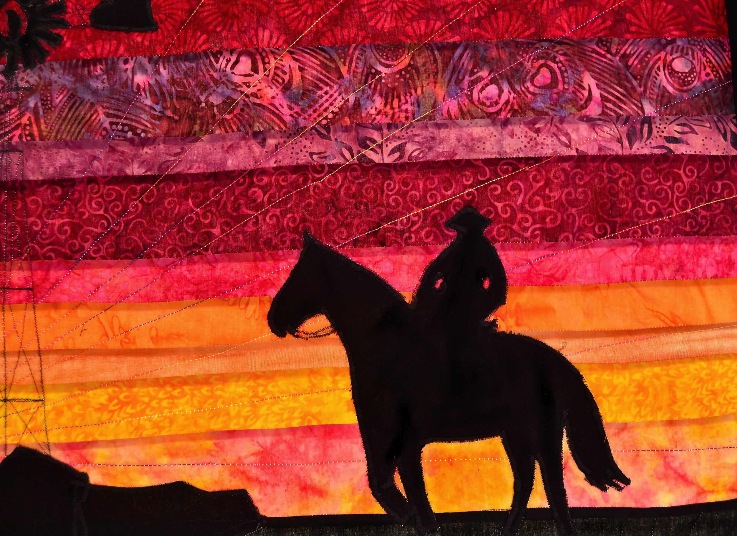
- The way you move between them – think of a rainbow
- And the patterns printed on the fabric itself.
When you go to a quilt store you will see whole shelves of the same color – like green – in 50 different shades and patterns. And any one of those shades and shapes of green could be right in the right project.
You have to make the right choice. Here’s the easiest way to do it.
Lay out your choices on the cutting table next to each other, stand back and look carefully at how they go together.
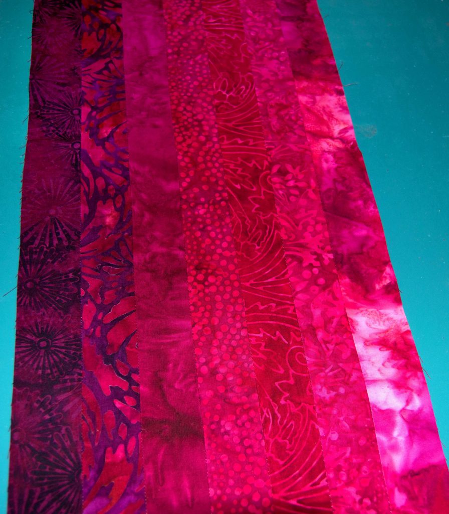
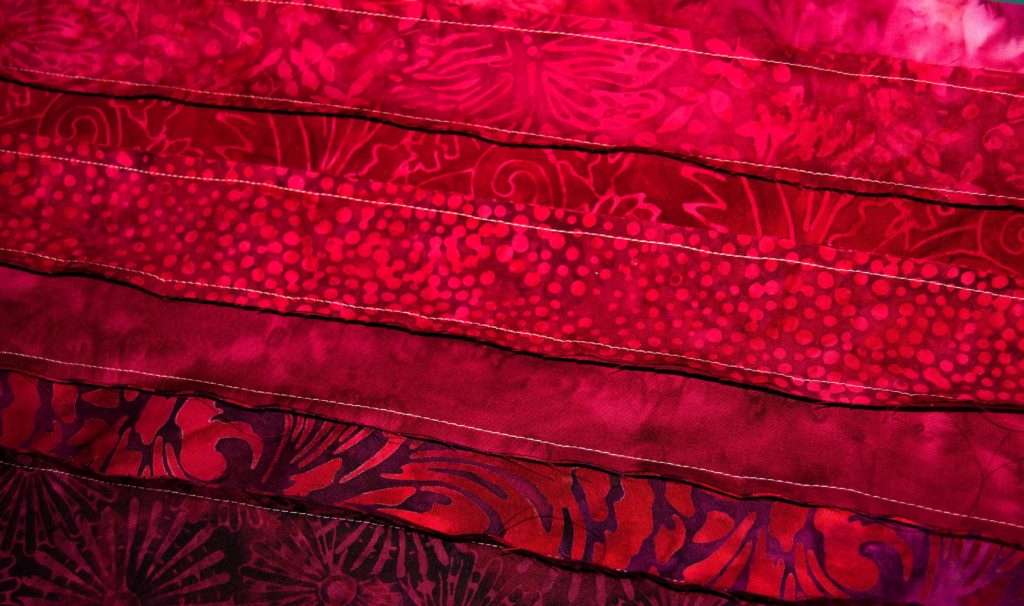
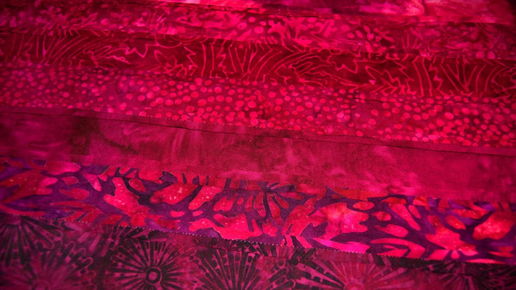
If you want to draw the eye subtly and gently, use different shades of the same color scheme from light to dark.
If you want to accomplish a visual punch to the brain, use bright, highly contrasting colors.
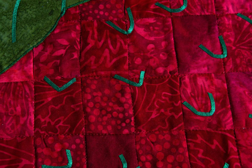
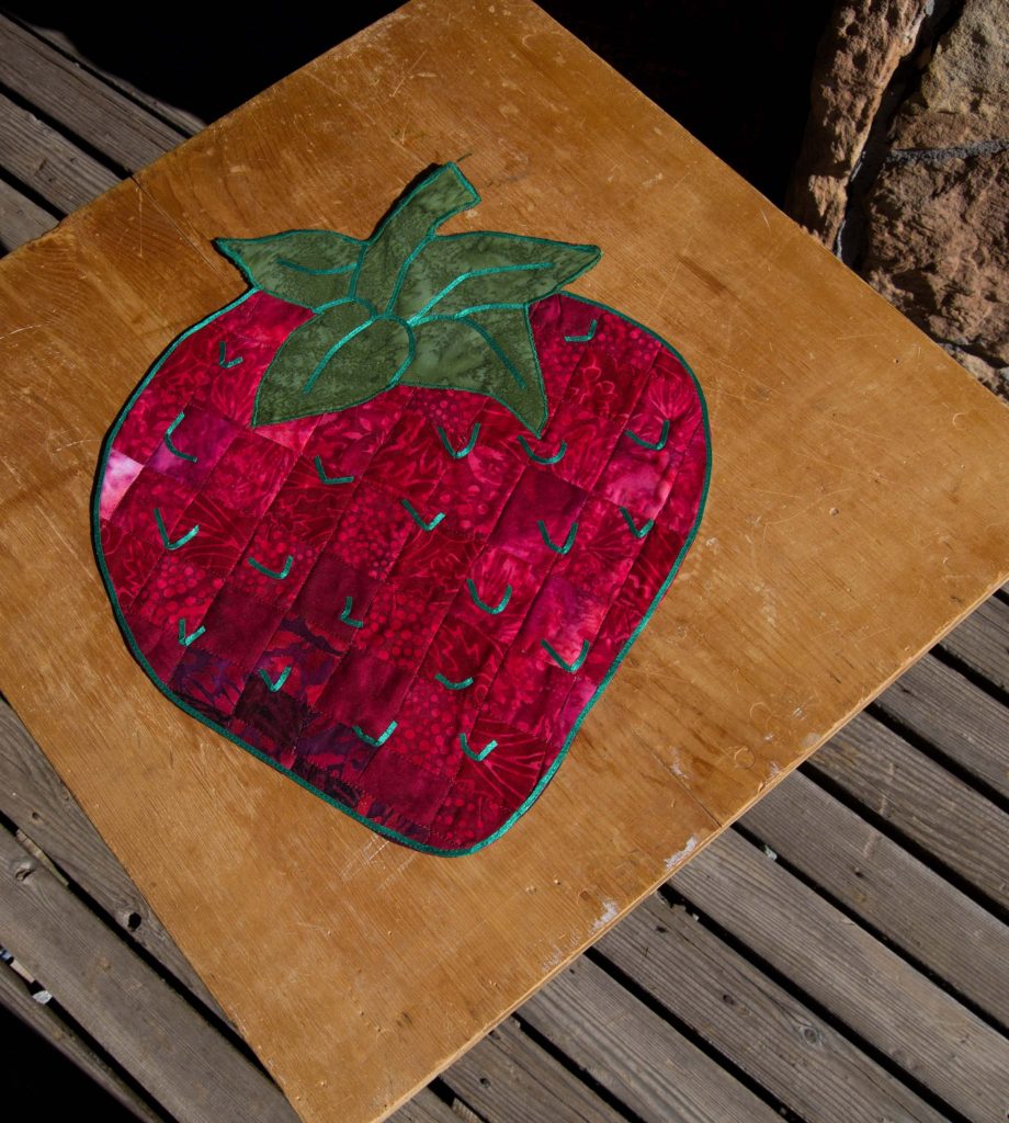
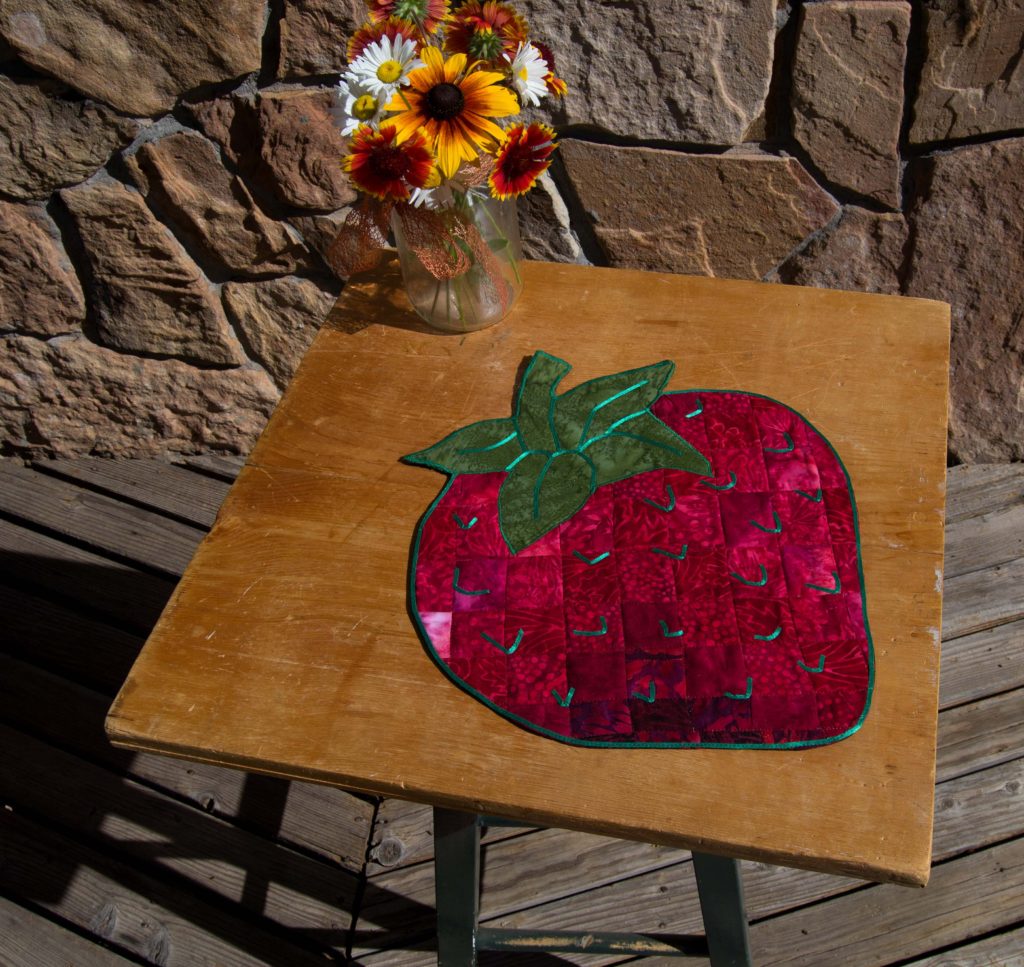
However, even a visual punch – such as a Bargello pattern – employs light-to-dark shades of the same color scheme to achieve its effect. For my ‘Bargello Strawberry’ table topper we used 5 different shades of red from light to dark.
The varying shades were very distinctive when we laid them out side by side at the quilt store, but when they were sewn into 1” squares it became very hard to tell them apart. What you see is a strawberry that moves from light-to-dark so subtly that it appears mottled – exactly like a real one.
Take the time – or make the time – to think about the effect you want from your finished project.
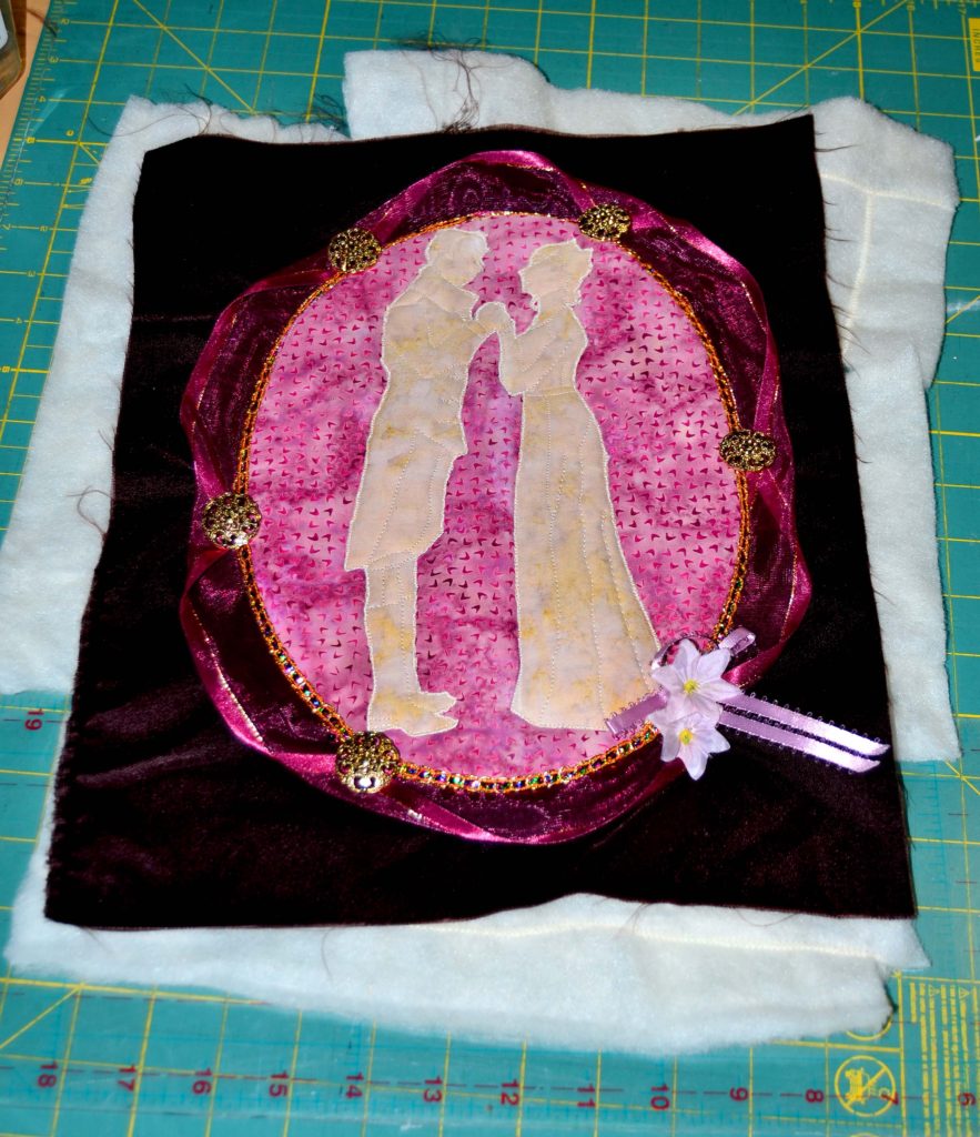
If you make a mistake in a color combination, you will usually be able to see it very quickly – as I did when I used blue in my wedding ring quilt. The first set that I put together just screamed at me, so I tore it apart and chose a different fabric.
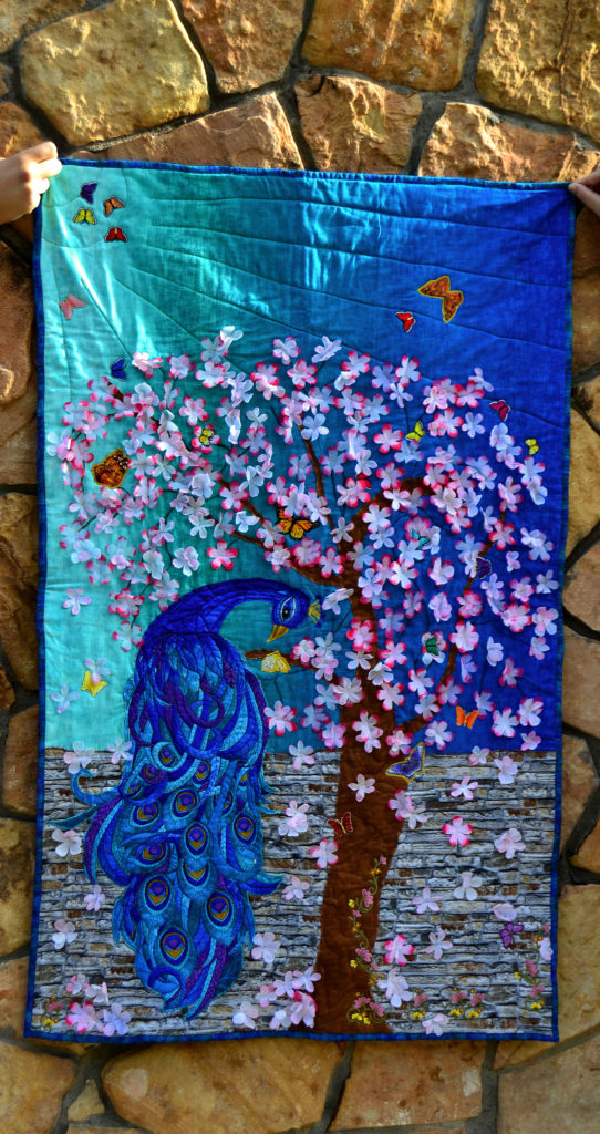
Consider Shadows in Your Fabric Choices
We often don’t think about shadows in real life. But shadows are the very definition of what we see. Shadows:
- Give depth to color
- Layers to scenery
- And impact to moments
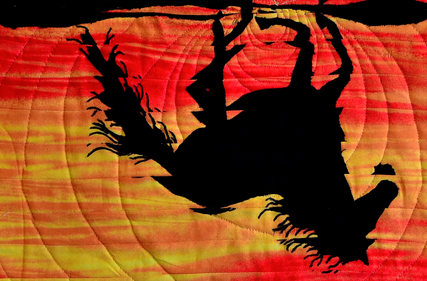
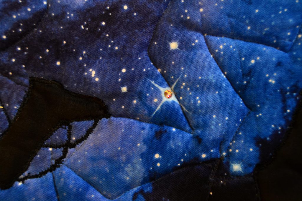
Most importantly, shadows create 3-D effects that enhances your background, makes the visual much more realistic, and adds a great deal of interest. Shadows should be added whenever you want to make something appear deeper or to show the way the light is moving.
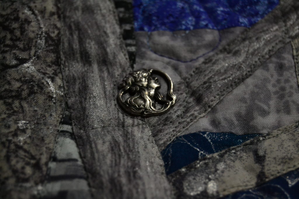
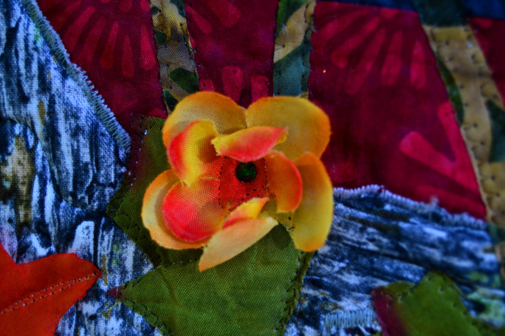
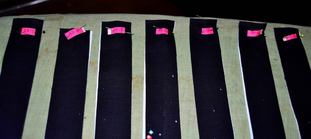
If you’re creating a stone wall, for instance, and using a grey mottled fabric for the stones, then you need to deepen the scene. You can do this by adding fabric strips of either darker grey or black strips. This will create the 3-D effect you need.
Experiment with the width of the “shadow” so that you achieve the right effect without overwhelming the main element.
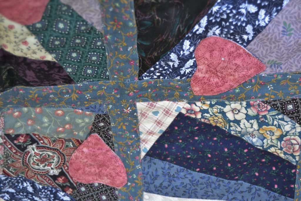
Another way to achieve shadows with fabrics is to use a darker shade in a strip-pieced pattern. I especially like to do this with crazy quilts, strip quilts, and pinwheels.
I also like to look at photographs and then try to model my shadow effects after them.
Pay Attention to Design and Pattern
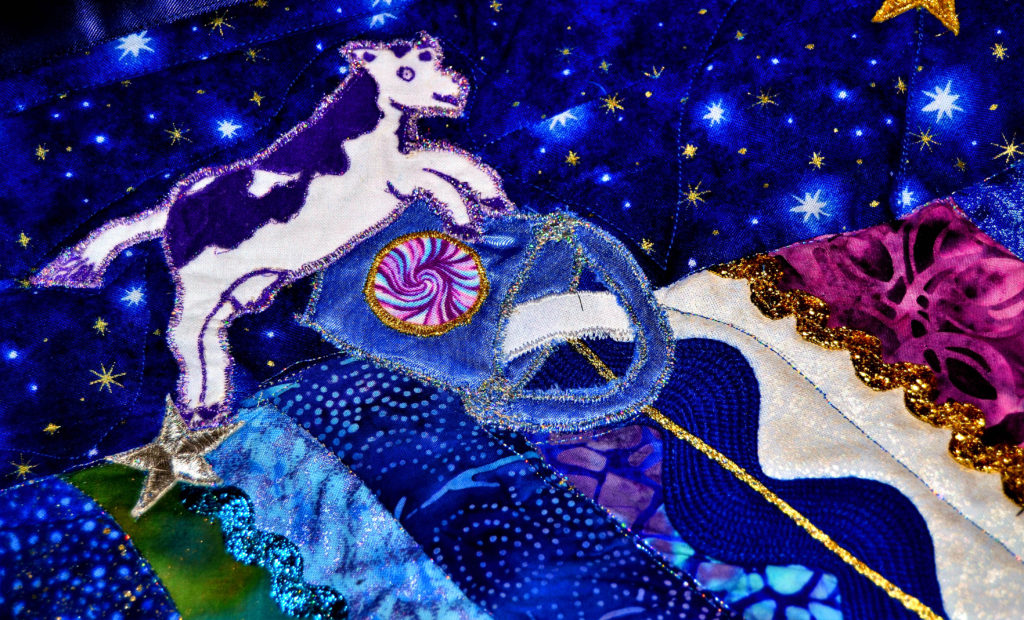
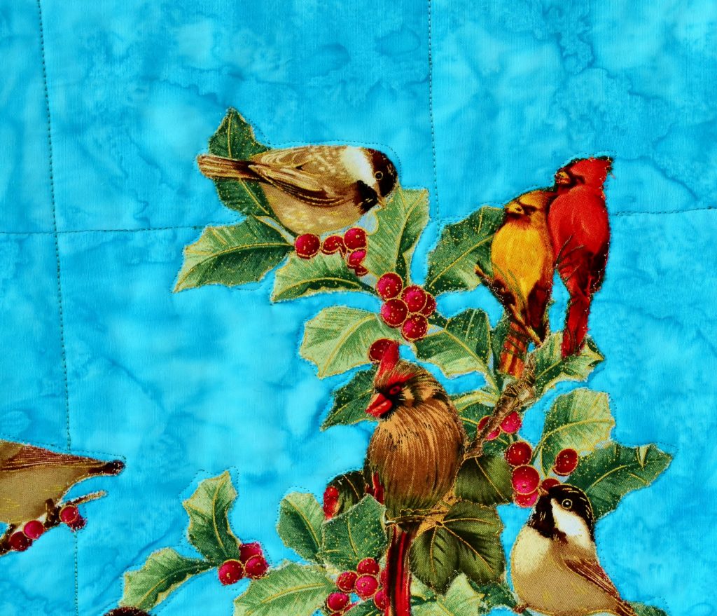
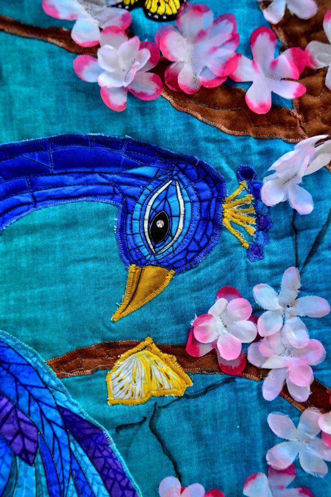
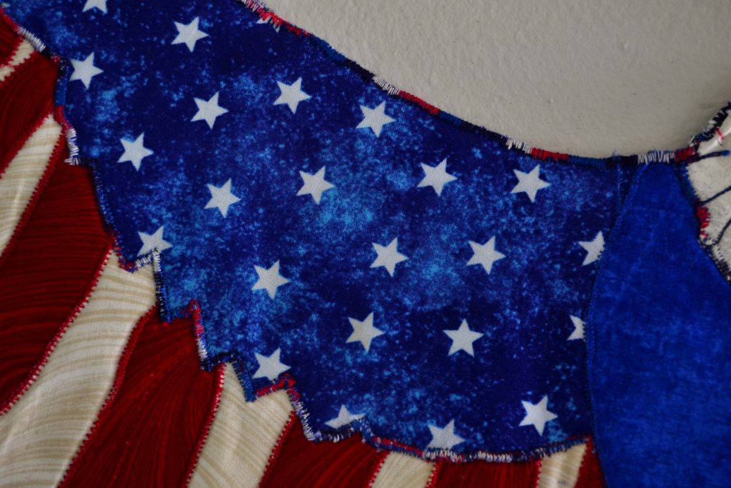
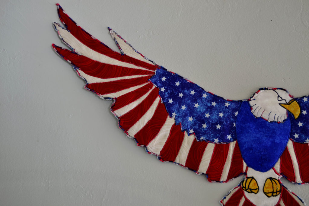
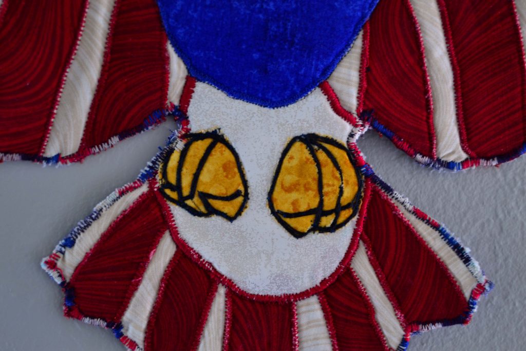
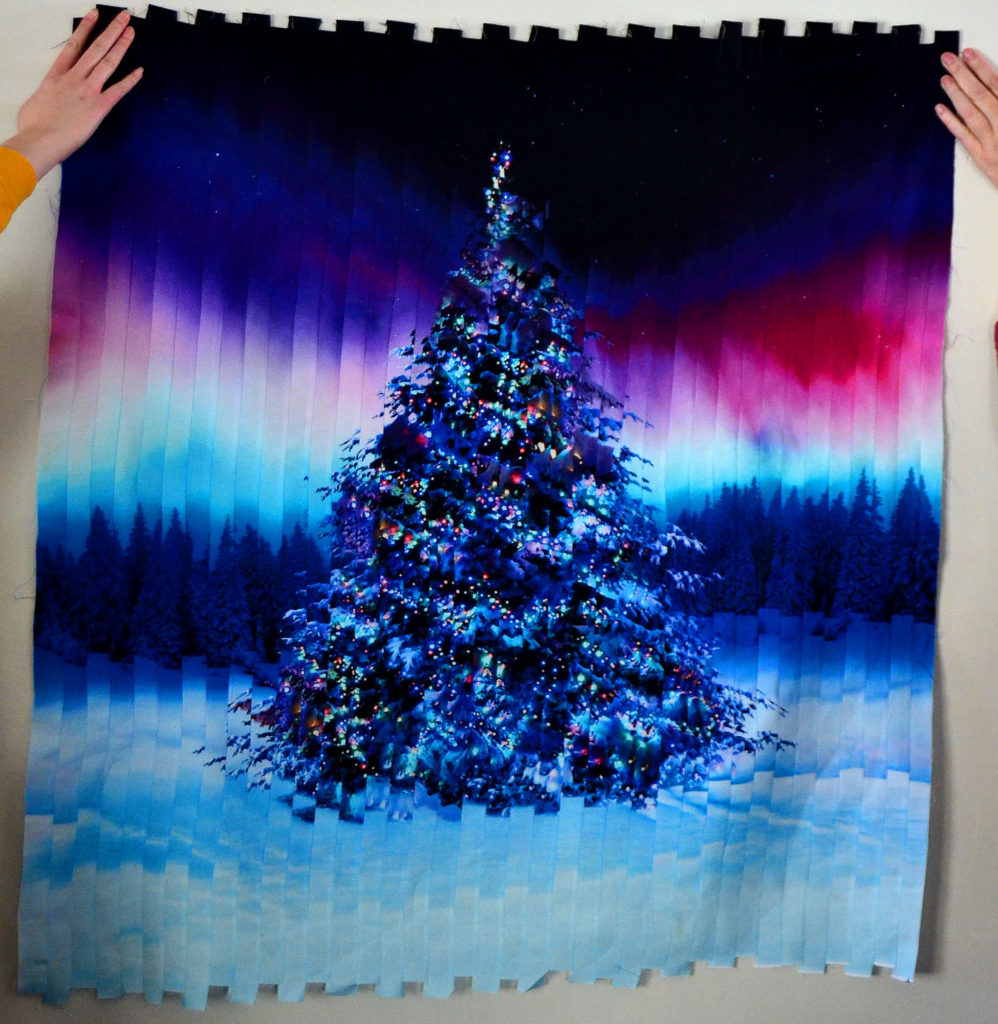
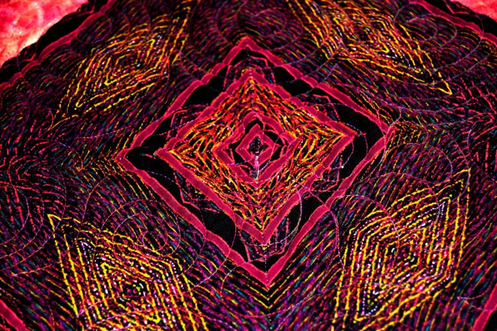
The other way to create movement with fabric is to use fabric printed with many different designs.
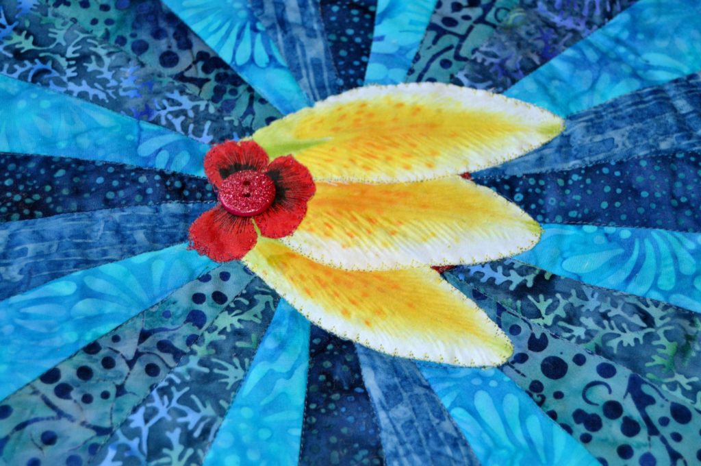
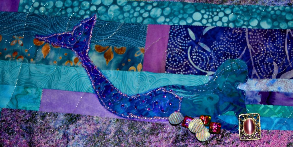
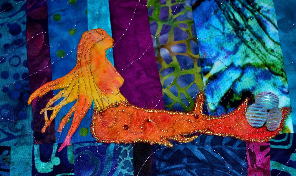
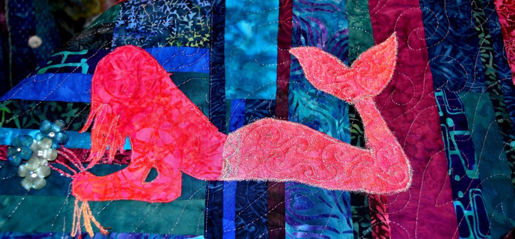
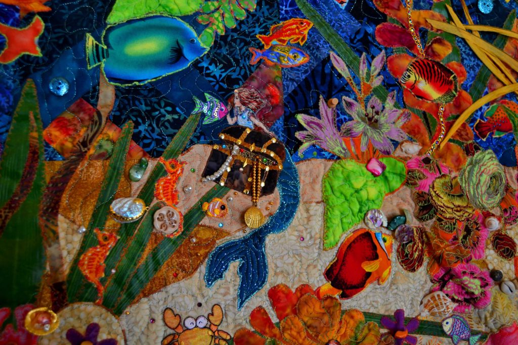
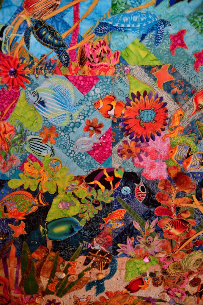
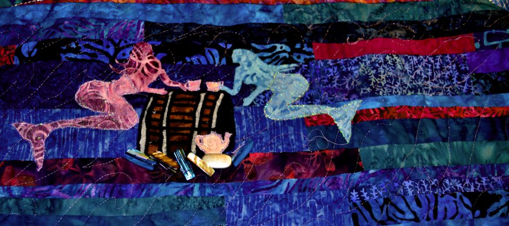
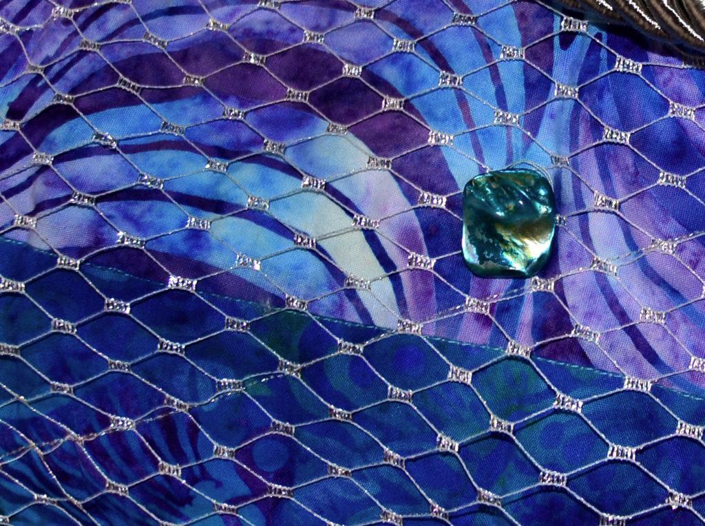
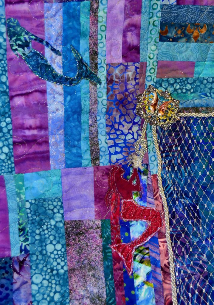
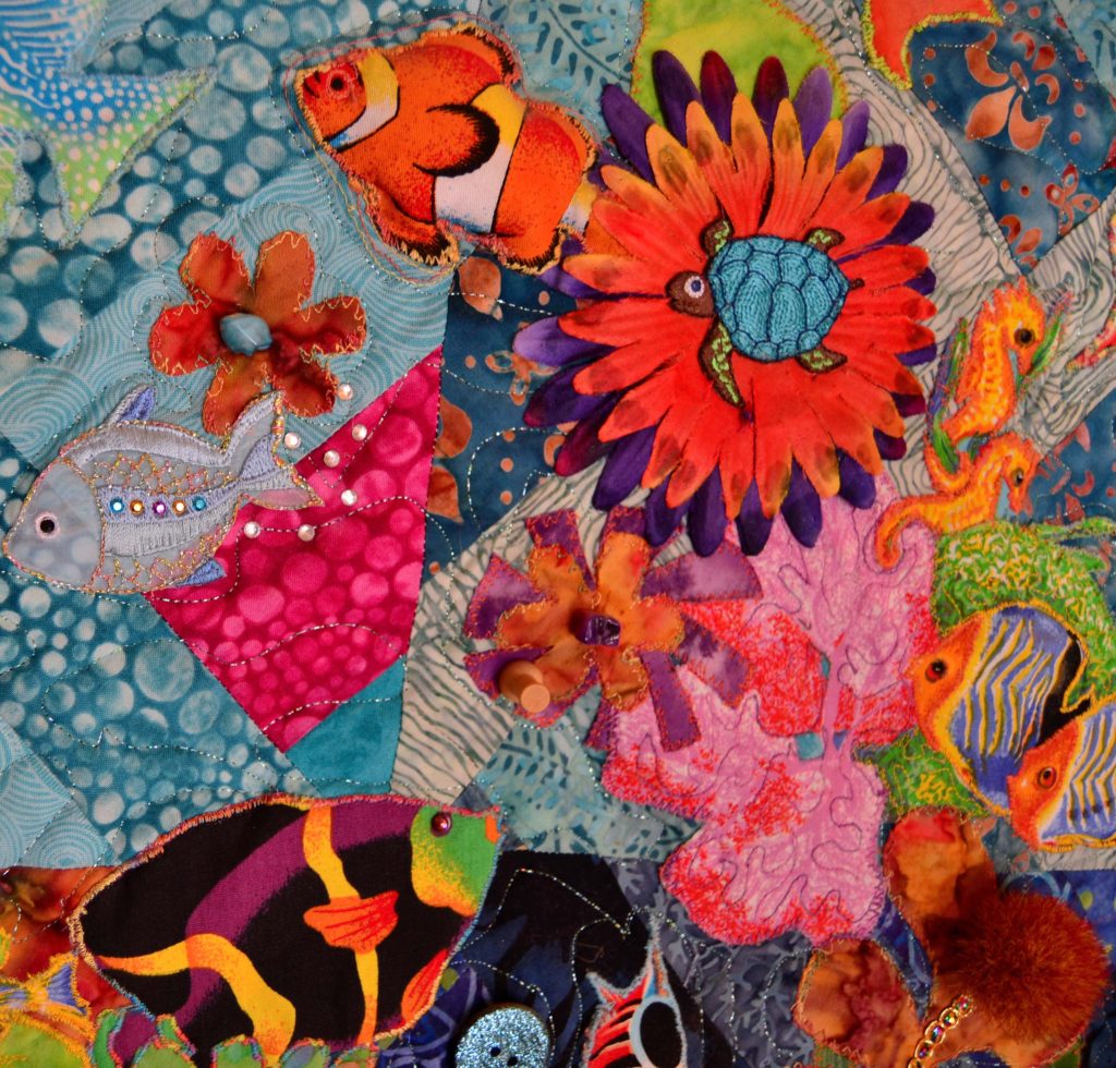
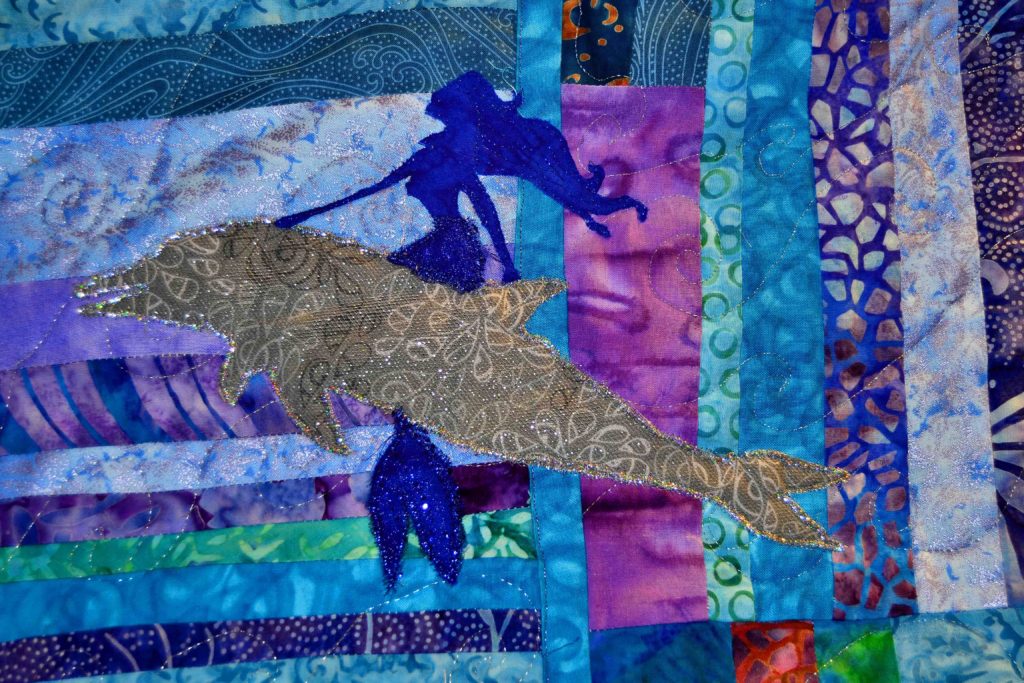
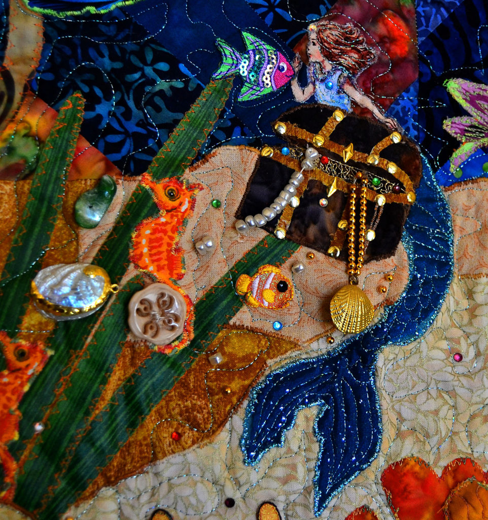
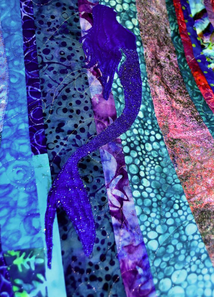
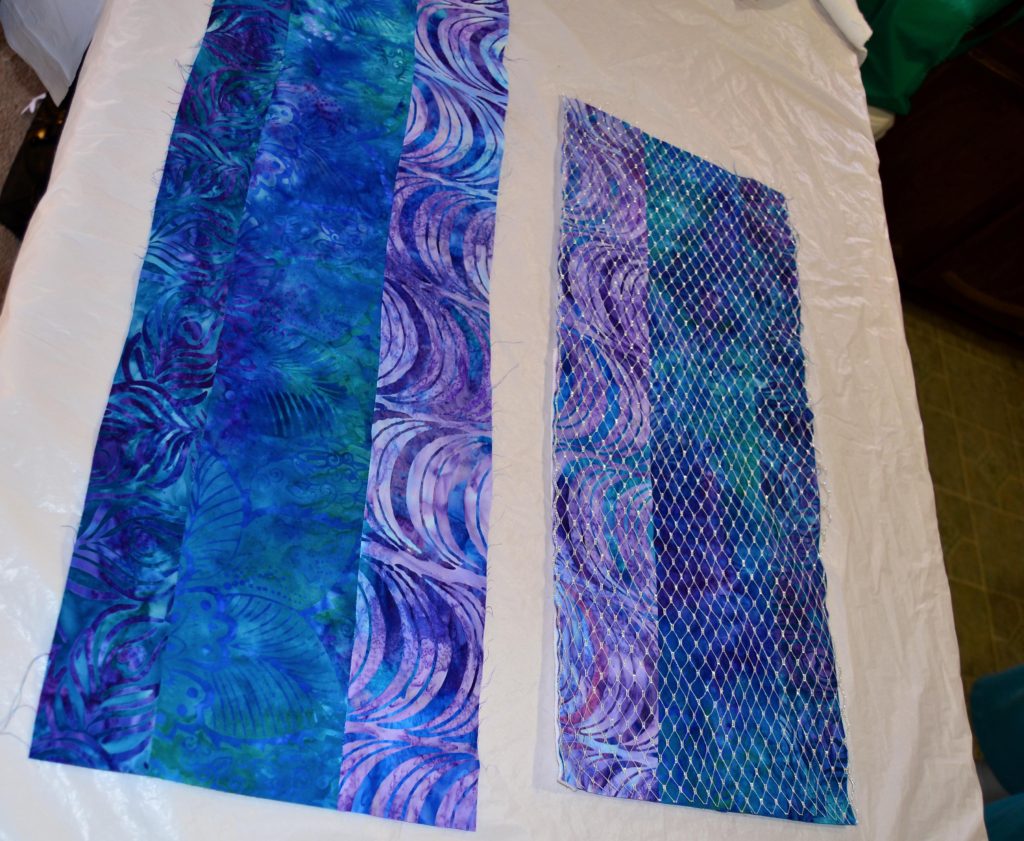
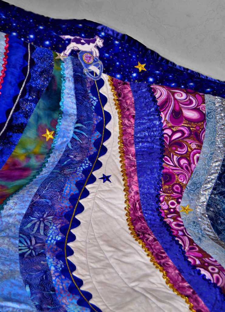
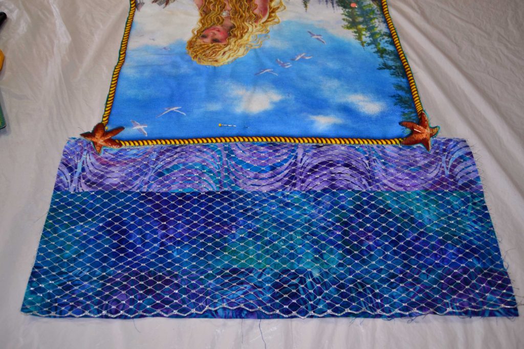
Having just finished my ‘Ocean Maidens’ quilt, I’ve spent a lot of time gazing at fabric with swirls (waves), bubbles (water), dots (floaty organic material), and leaves (ocean flora and fauna).
The entire quilt appears to move, especially as we moved the fabric from light through dark to simulate the ocean from top to bottom.
If I had chosen the exact same color scheme but in plain fabrics only, my ‘ocean’ would just lay there, boring and dead. So always plan ahead and know what effect you want to achieve before you lay out one cent or make your first cut.
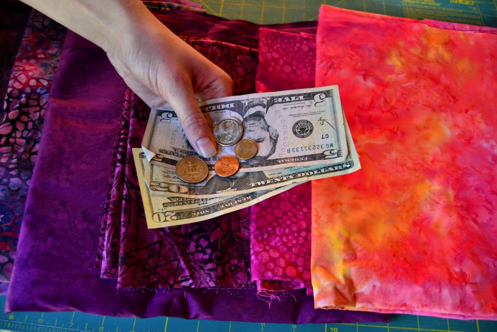
How to Save Money & Avoide Mistakes
As always, I’ve got a few items on my “don’t” list, as well. Knowing what not to do, what not to choose, and why not will go a long way in saving you time and money.
“Don’t” Tip #1
Unless you absolutely have to, don’t buy plain fabric.
You’ll really maximize your moneys’ worth by purchasing multi-colored fabric or fabric that is printed with a design in the same color scheme.
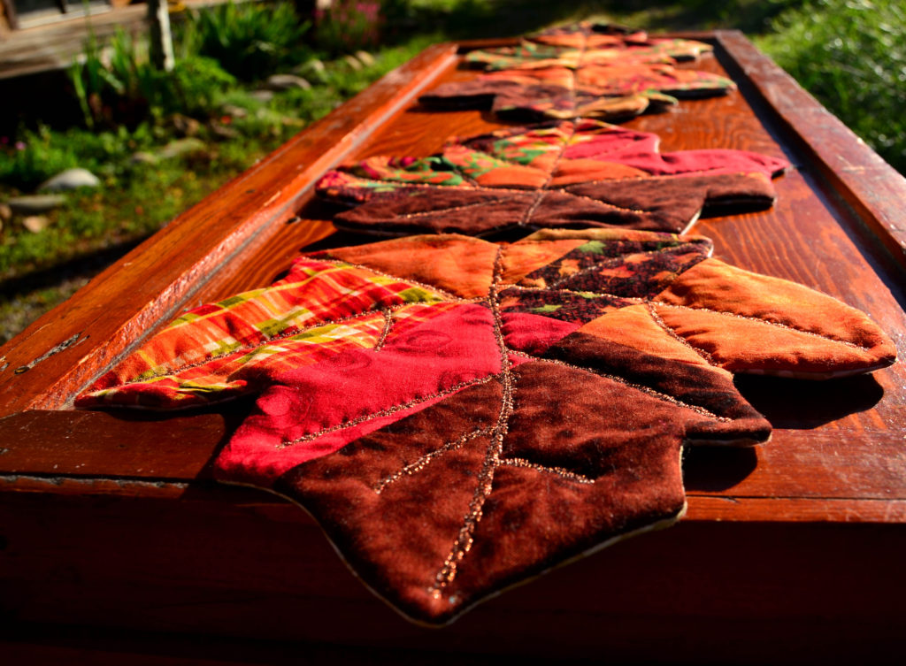
The multi-colored fabric allows you to bring in any other color that’s also printed on the main fabric. If you have a gold-based fabric with green & orange swirls on it, then you can bring in green and orange fabrics and they will all run together – which is the exact subtle effect we’re looking for.
Fabric that is printed with a design – such as bubbles – will often use the same color scheme from light-to-dark, which allows you to bring in each of these shades. This simple trick moves color through your project and moves your eyes to follow it, thus creating movement with fabric.
Simple!
“Don’t” Tip #2
Try not to buy on a whim, ever. If you’re super-attracted to a fabric, chances are you already have something similar.
Always go through your stash before you head for the quilt store to buy fabric for a new project.
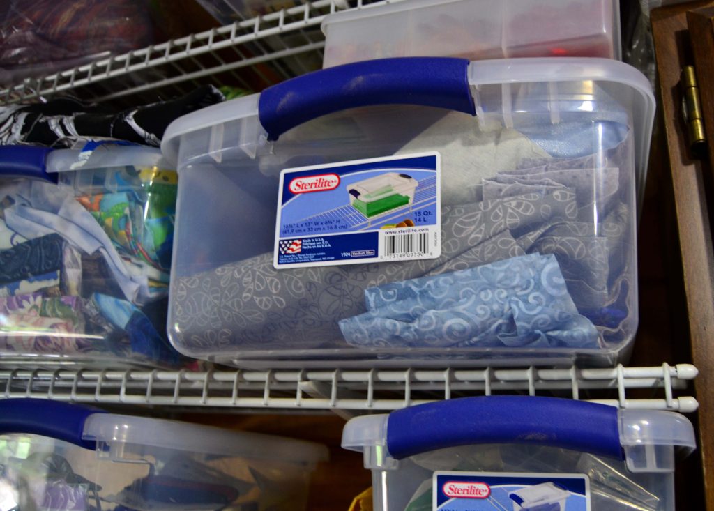
If your stash is anything like mine, you can often find all the fabrics you need right at home without investing a cent. Remember, most of the time you’ll only be using a quarter yard of any one color in any project – if that – so you don’t need an entire building to stash your stash.
If you don’t have the exact right color:
- Take your project and the fabrics you have already chosen from your stash to the quilt store
- Mix and match carefully
- Buy only what you need.
You’ll save a lot of money this way and keep your stash under control at the same time.
“Don’t” Tip #3
Don’t allow yourself to be bullied into fabric choices that you loathe just because it’s what’s hip or modern. Or even if it’s called for in the pattern.
Personally, I have to love the colors of the fabric I’m working with or my dislike shows in the finished piece. Besides that, I get no joy out of creating it and life is way too short to spend time on things that you don’t like.
I absolutely loathe the ‘modern’ color combination of pale, washed out teal and that anemic brown you see everywhere and I refuse to spend one cent in buying those color schemes.
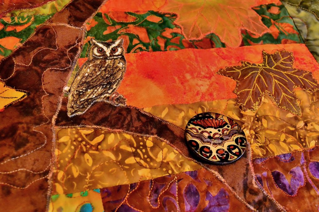
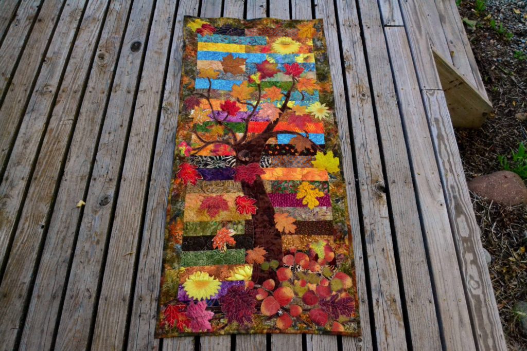
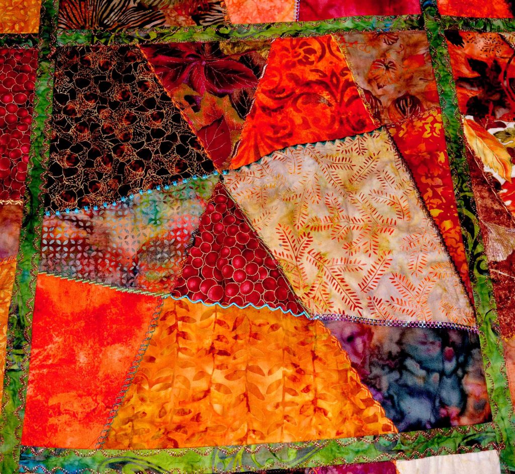
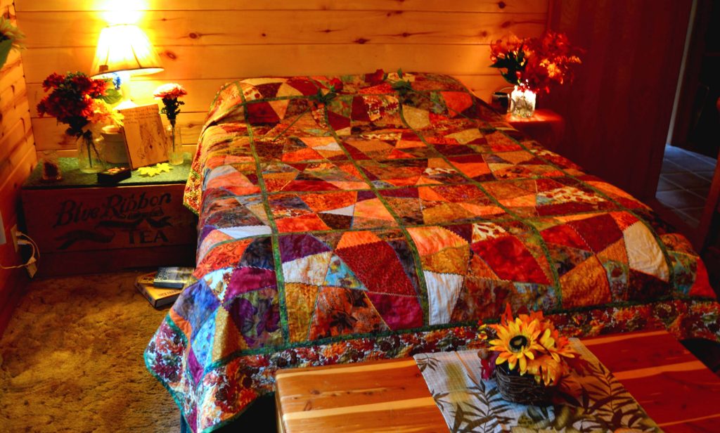
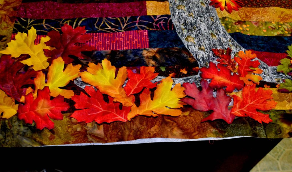
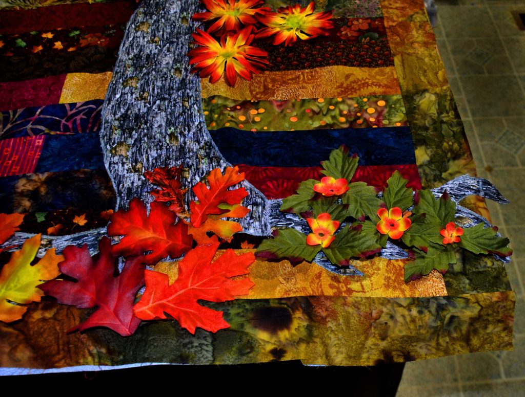
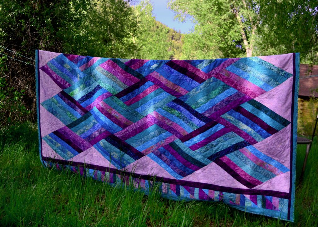
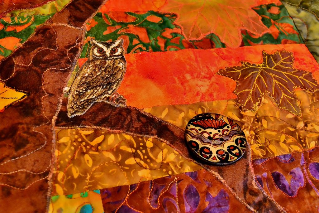
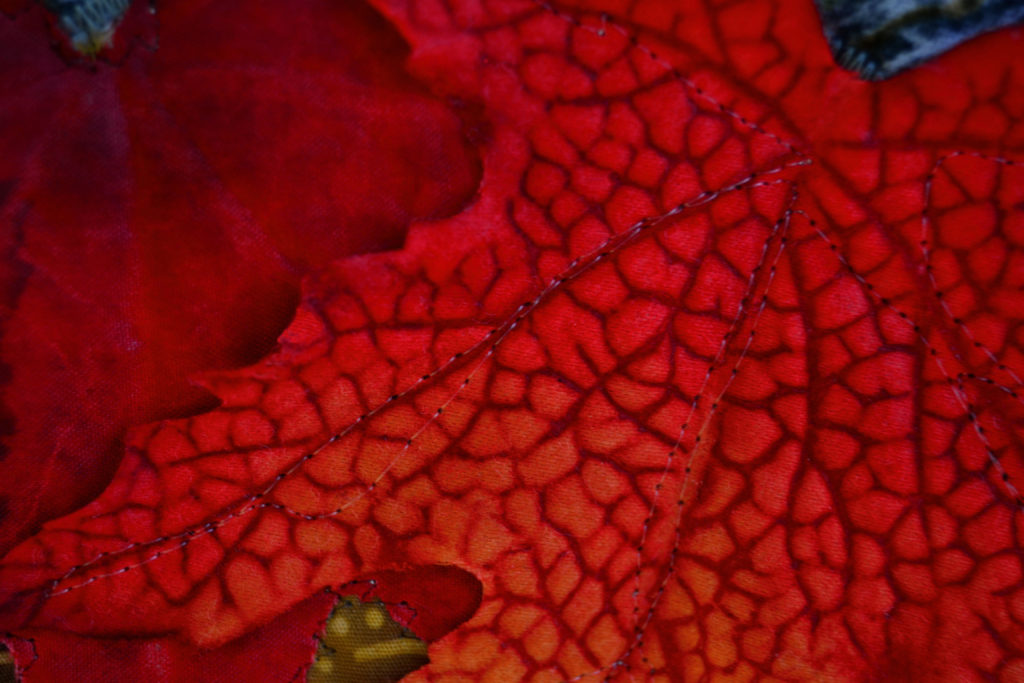
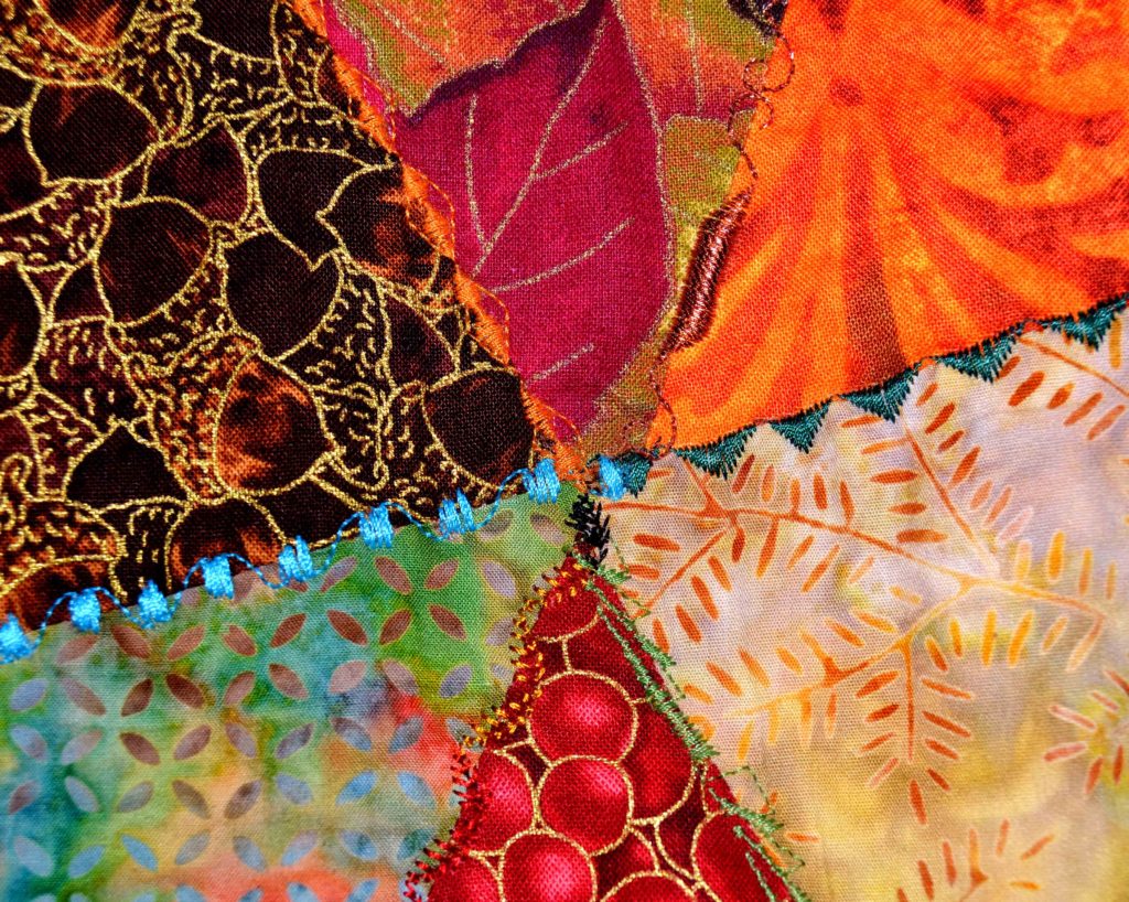
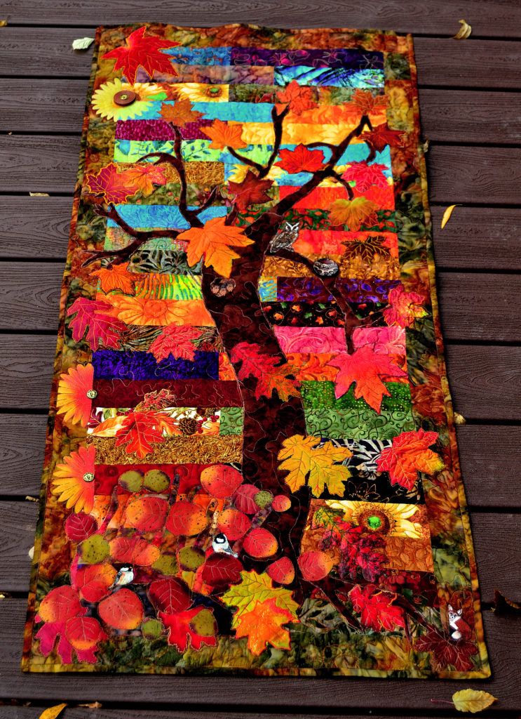
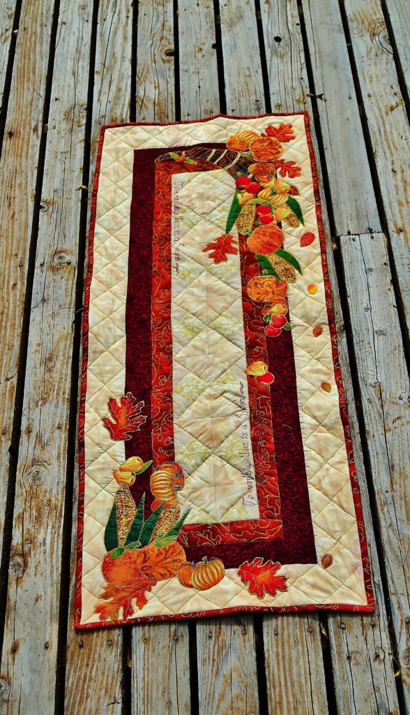
As I’ve said before, autumn is my favorite season so I have a great many of those fabrics in my stash. I also love the jewel tones of purple, turquoise and jade – so I have a lot of that.
Different colors – whole new art set
It’s amazing how many different places you can use these colors.
And often patterns, even traditional patterns, don’t need to have the exact fabrics.
When I did my one and only Jinny Beyer quilt I used the fabric supplied in the kit – because I loved those colors. Later I saw a quilt at the quilt store that used shades of purple, green, and turquoise instead of pinks, reds, and purples.
The effect was, and almost always is, equally stunning.
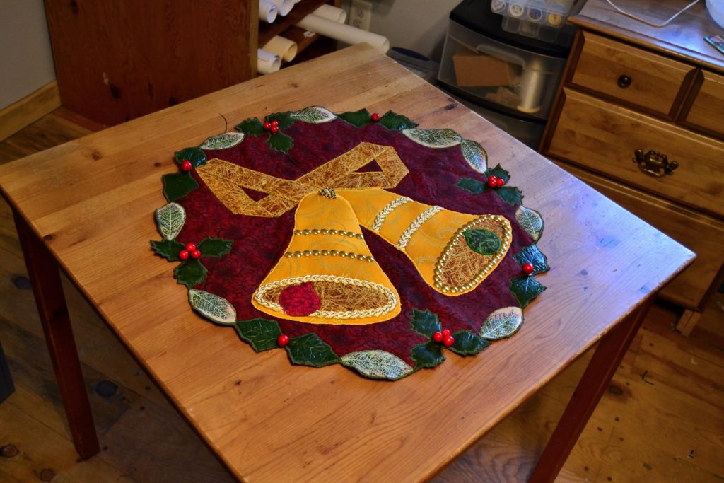
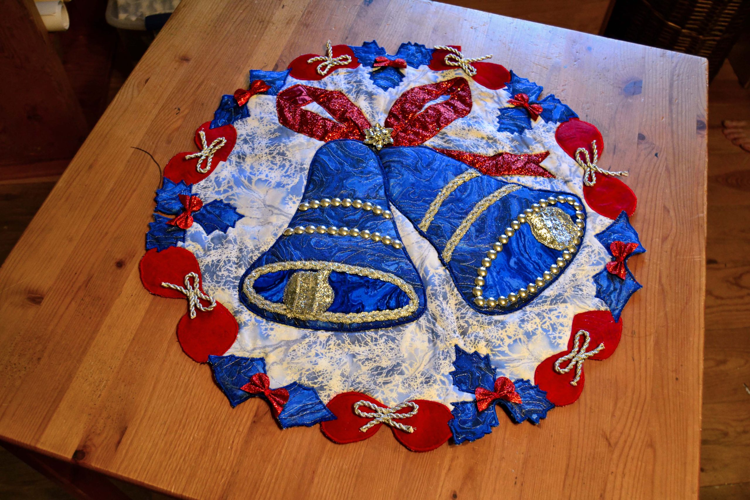
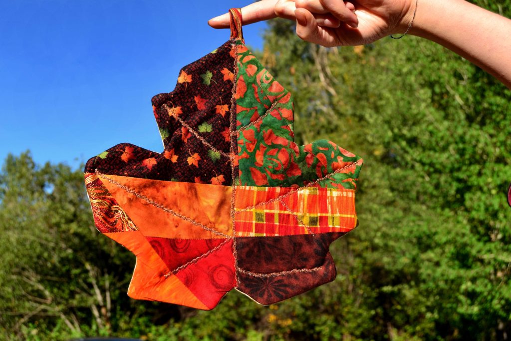
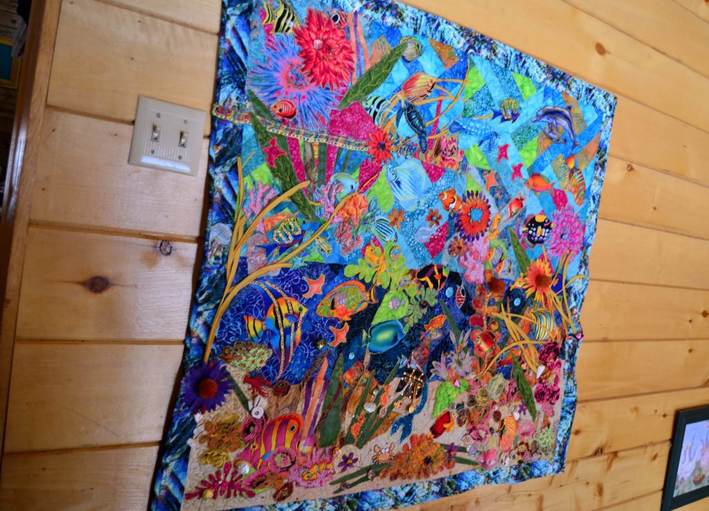
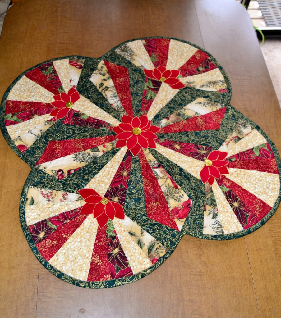
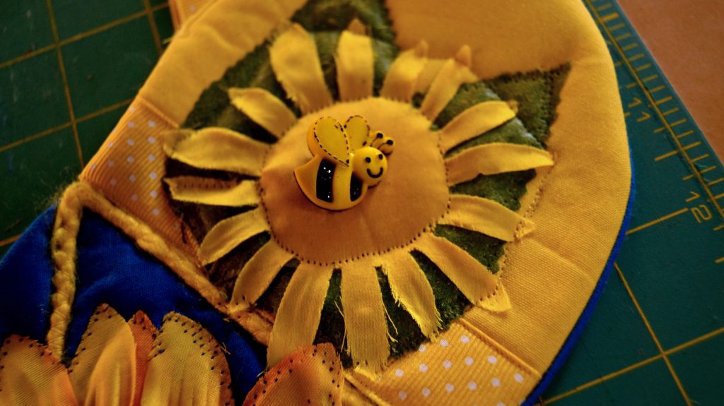
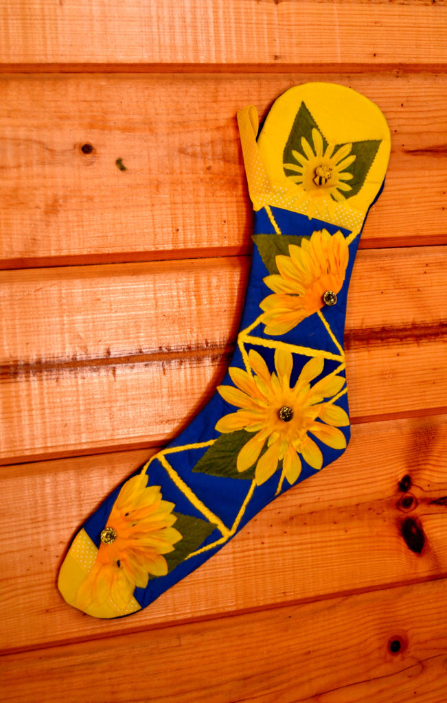
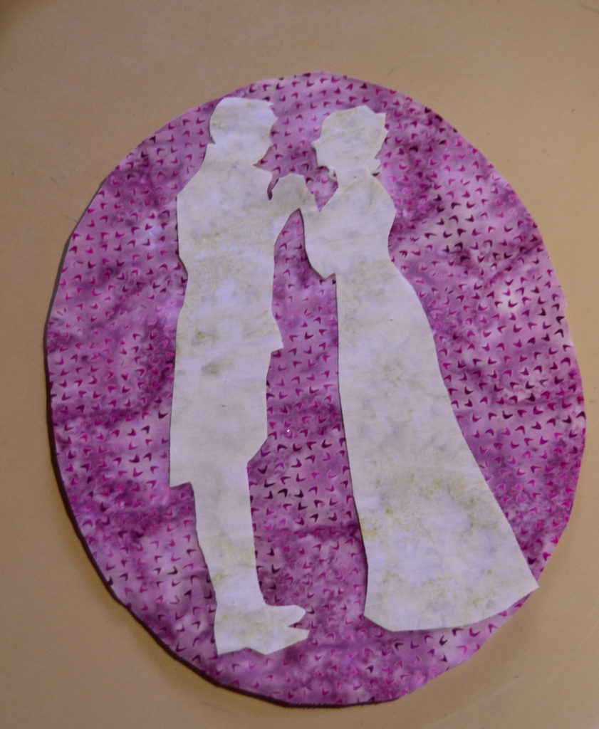
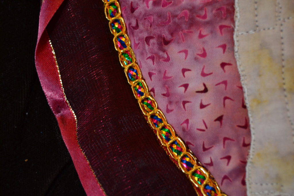
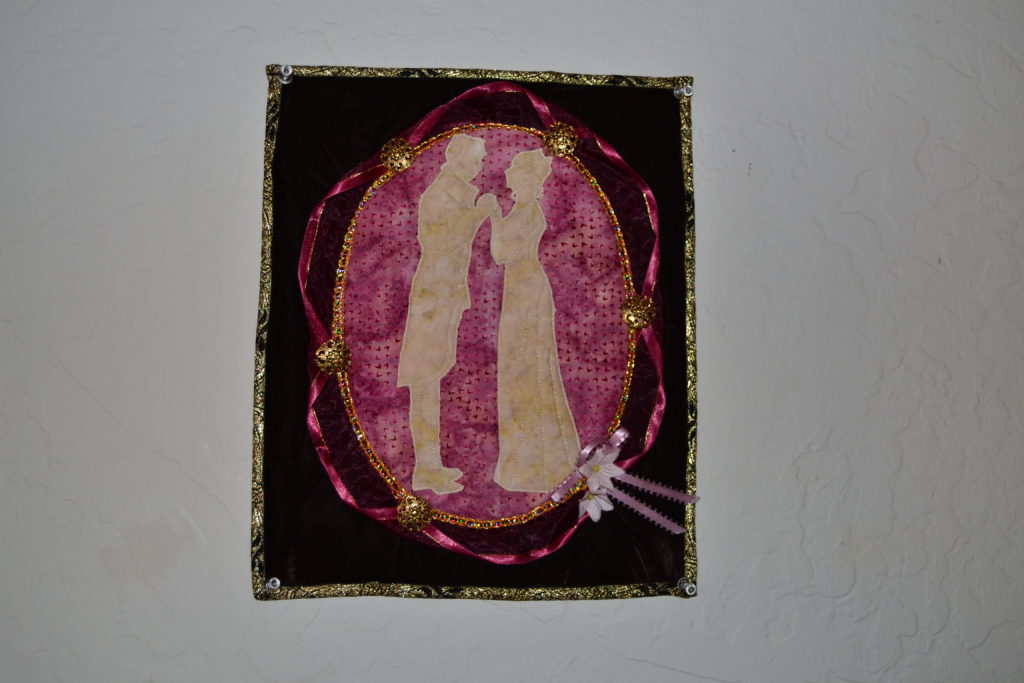
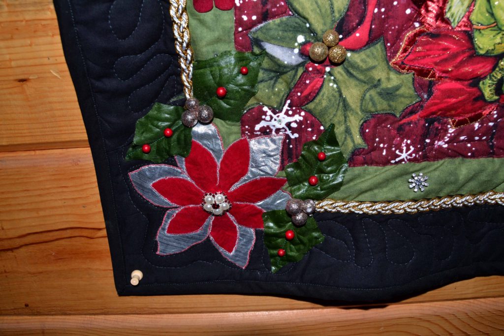
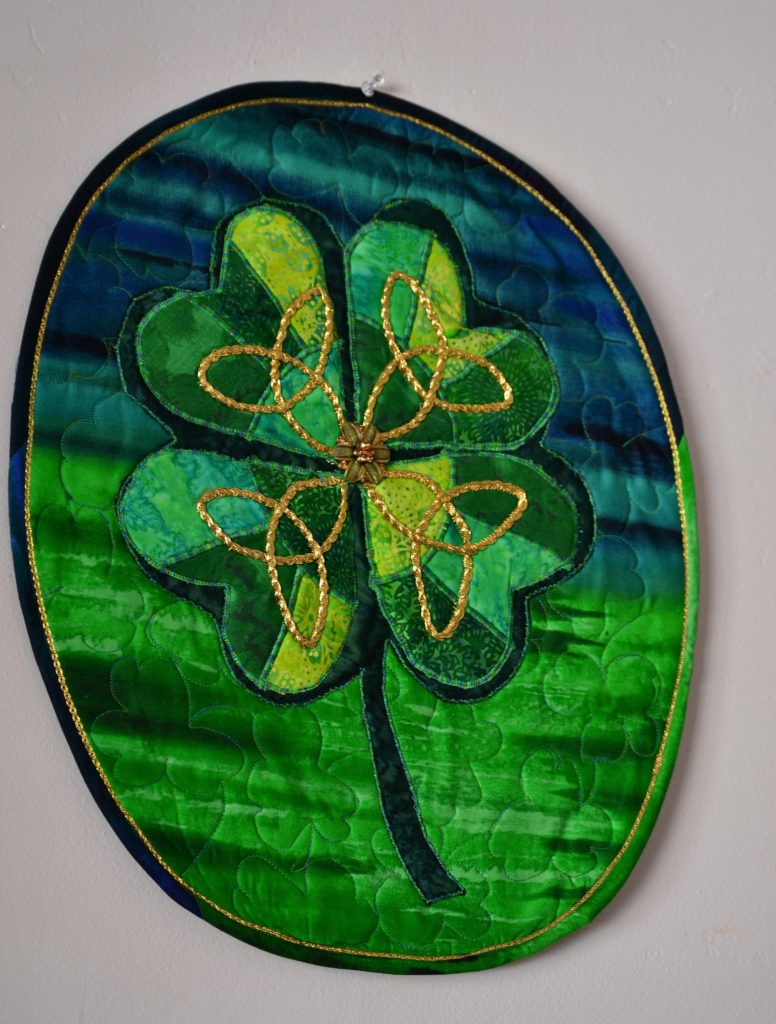
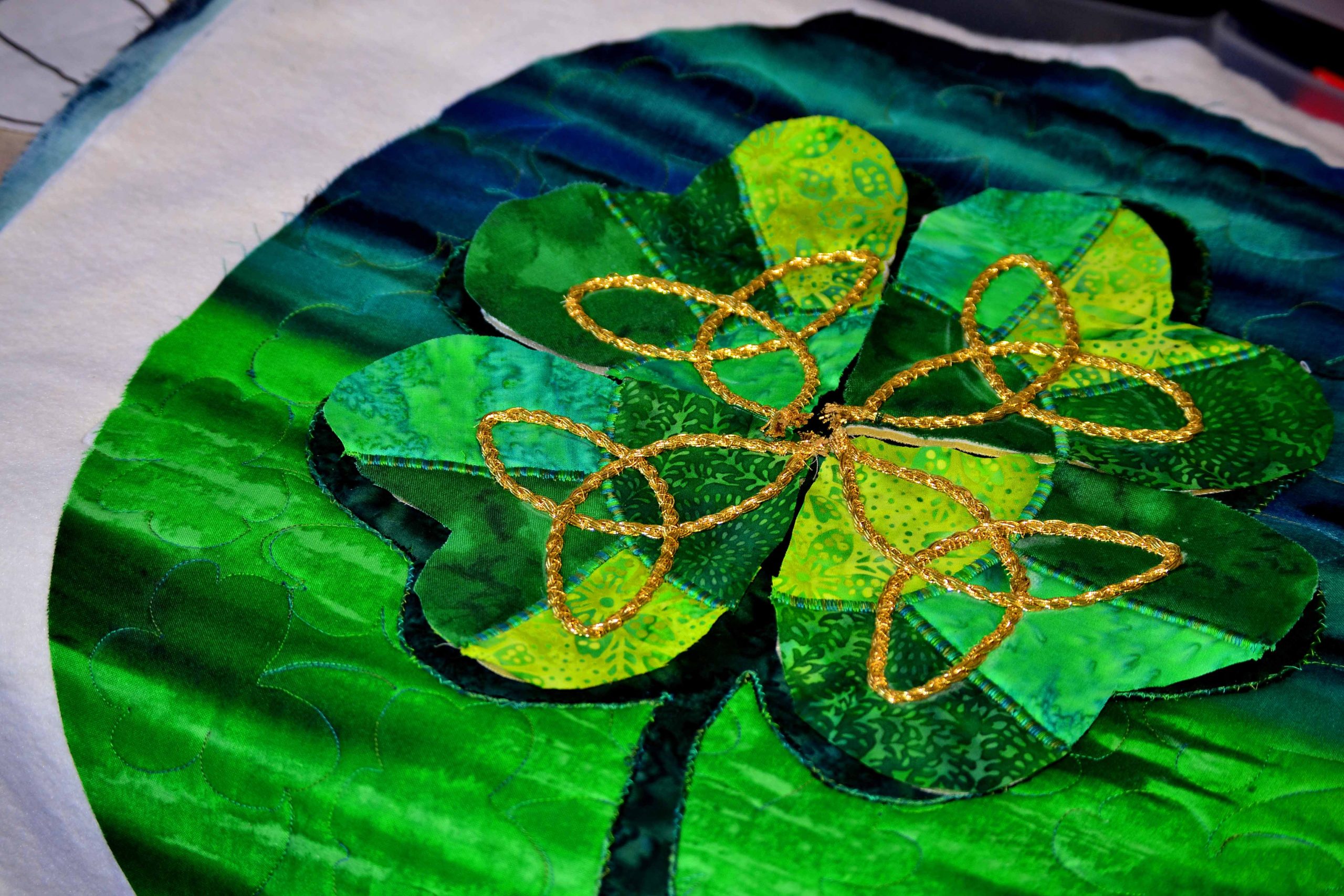
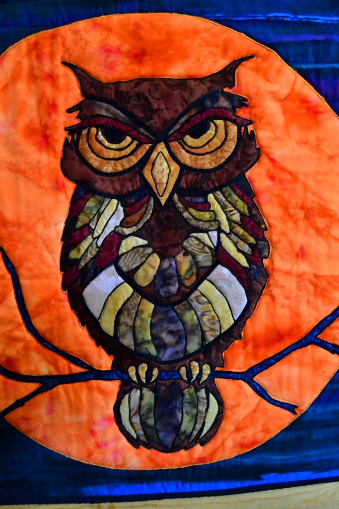
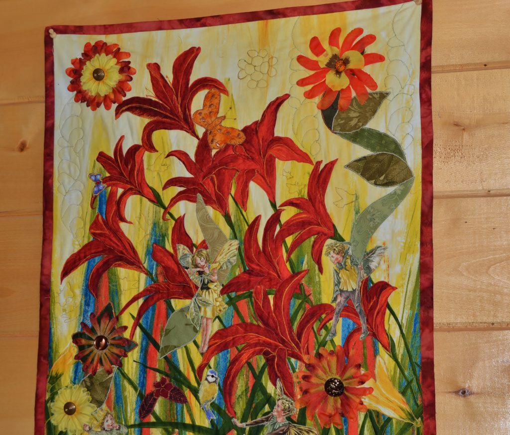
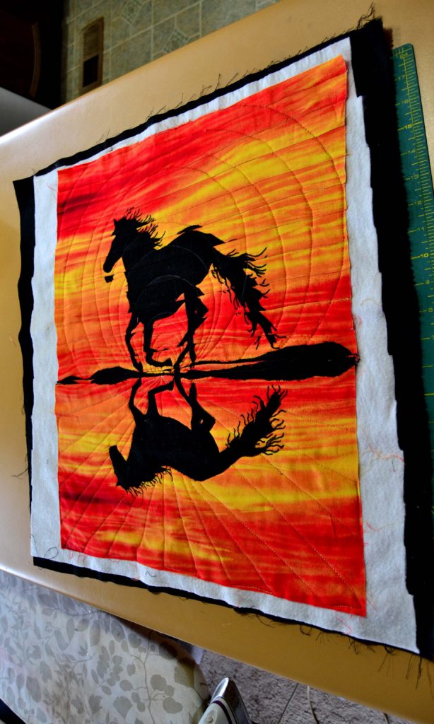
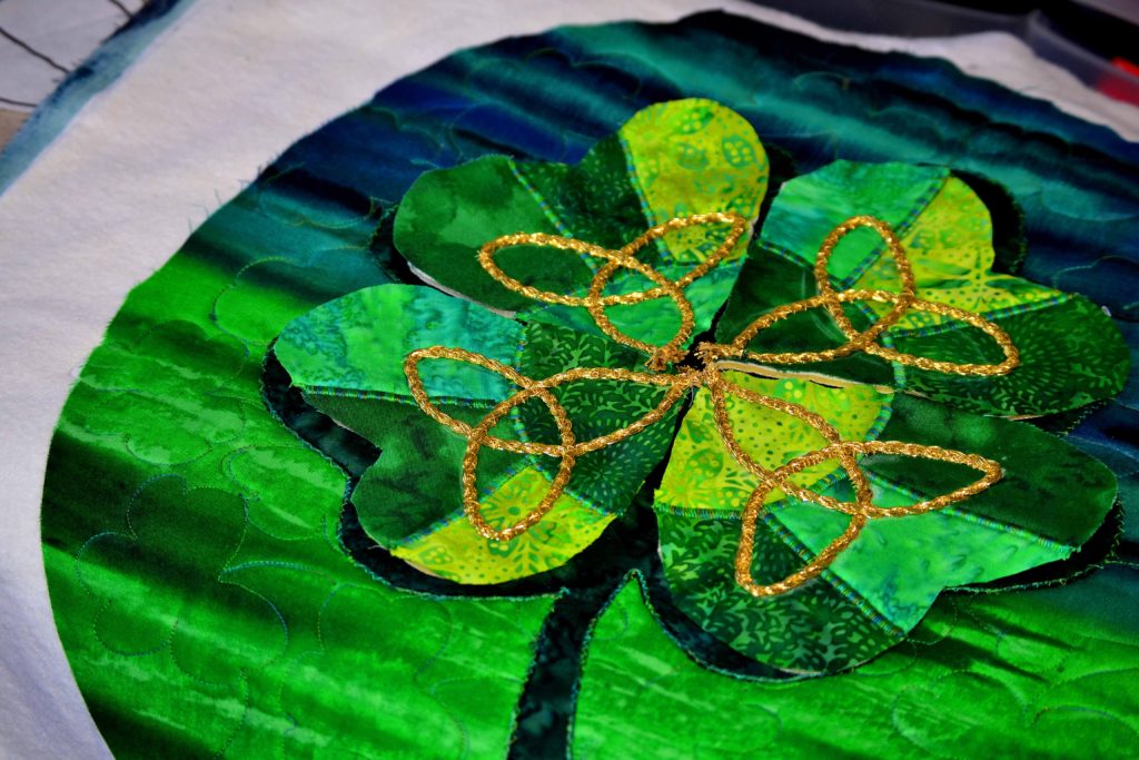
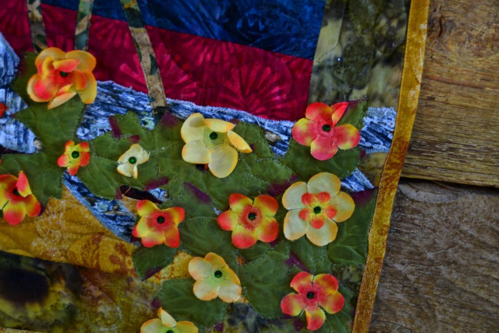
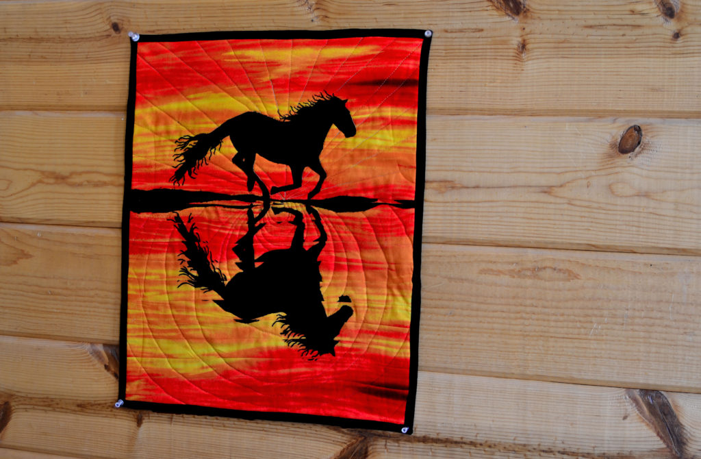
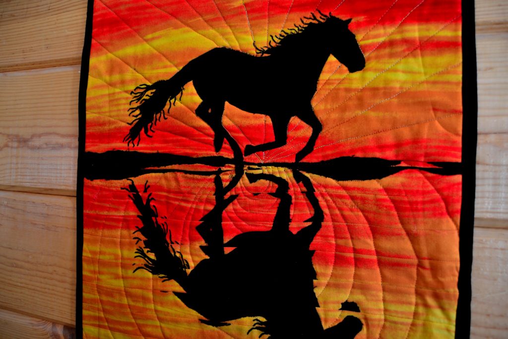
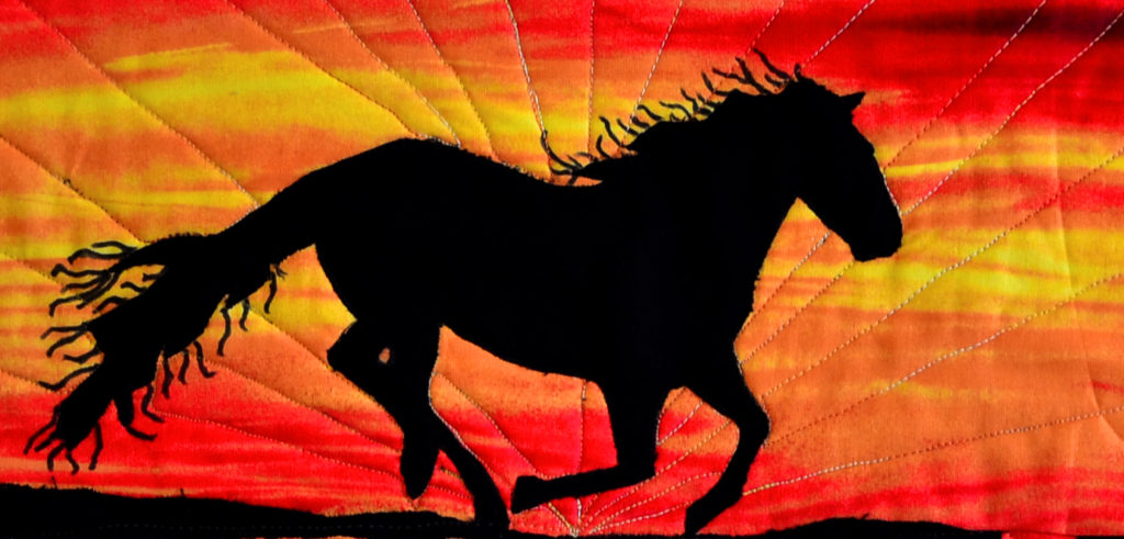
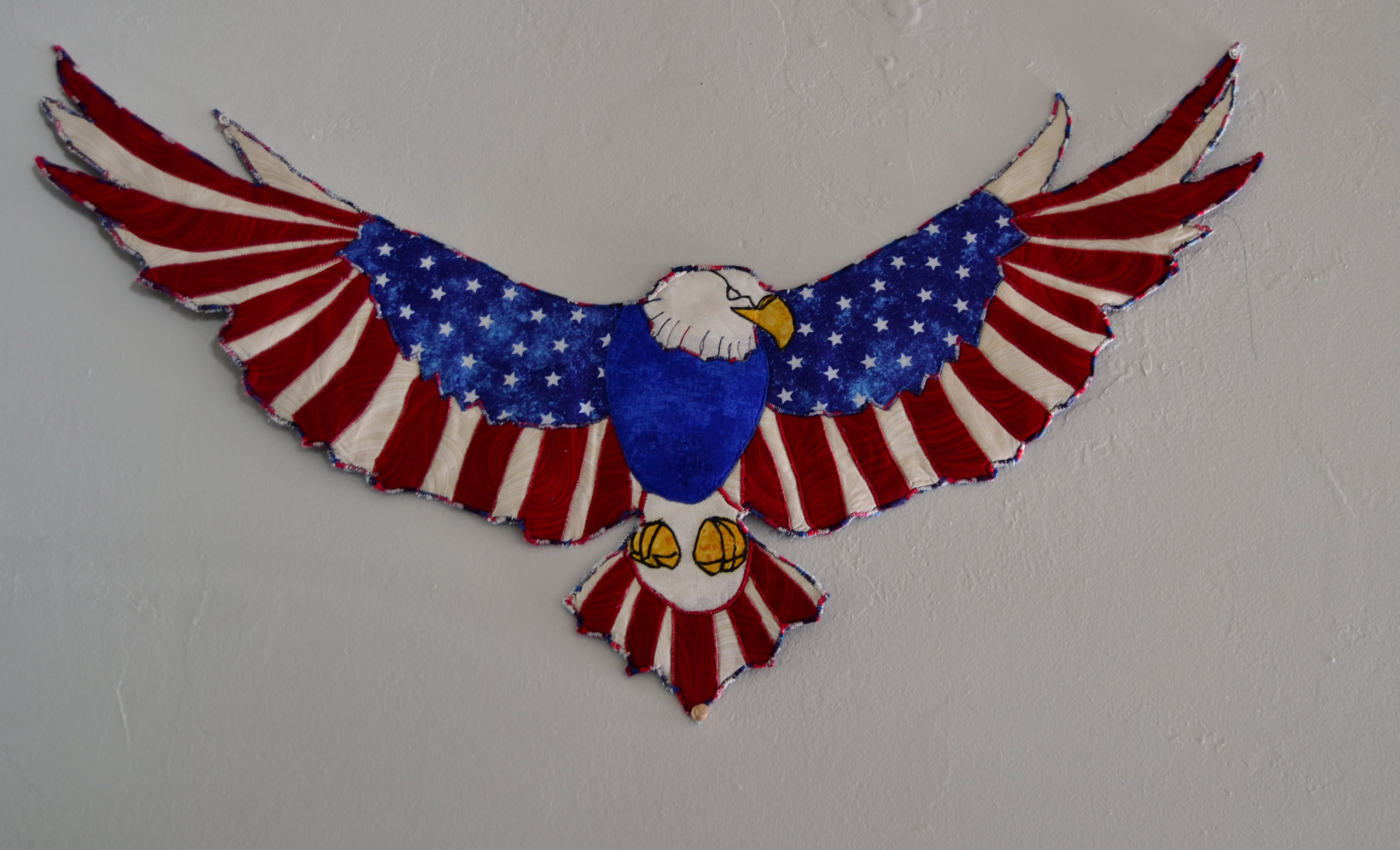
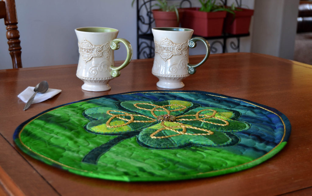
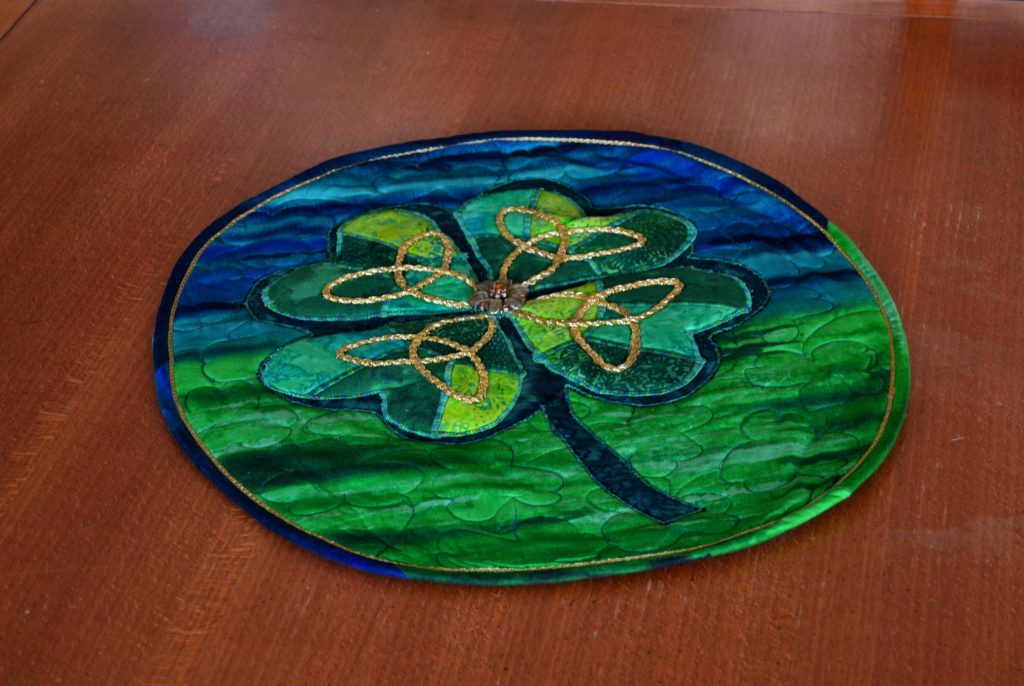
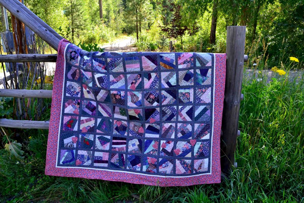
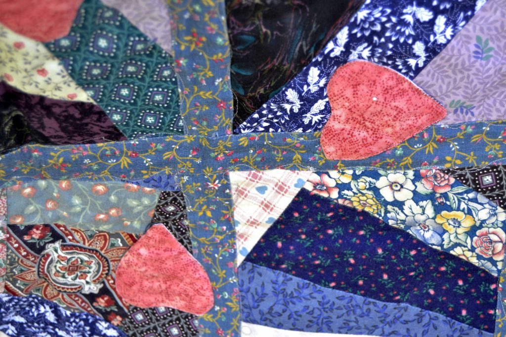
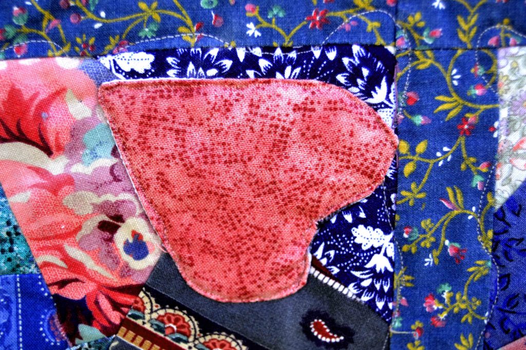
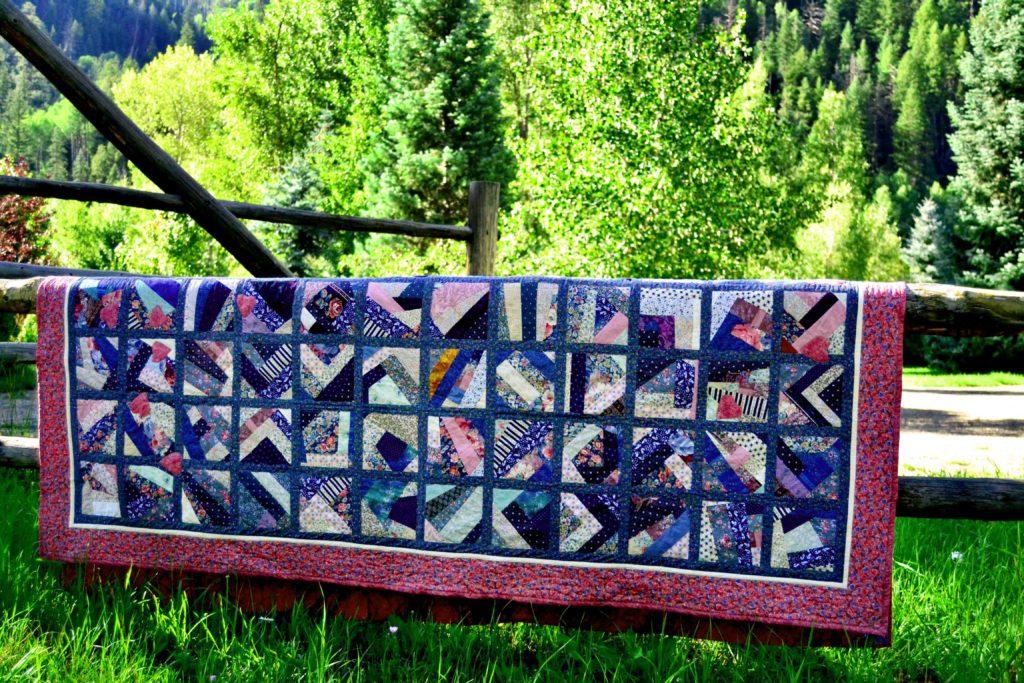
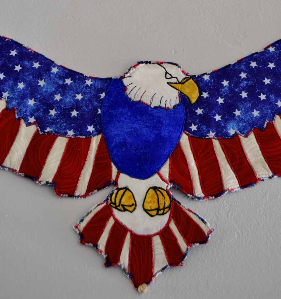
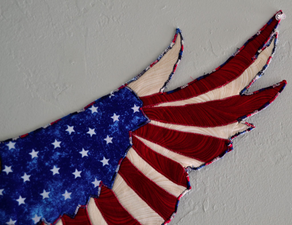
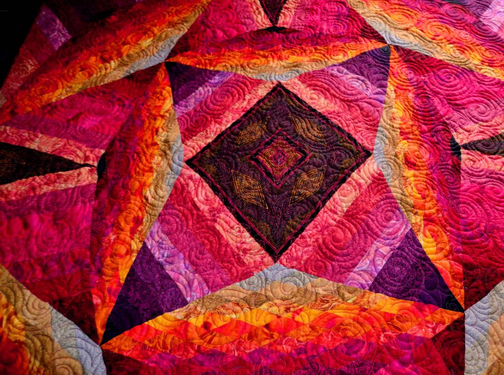
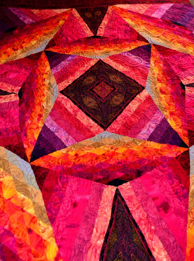
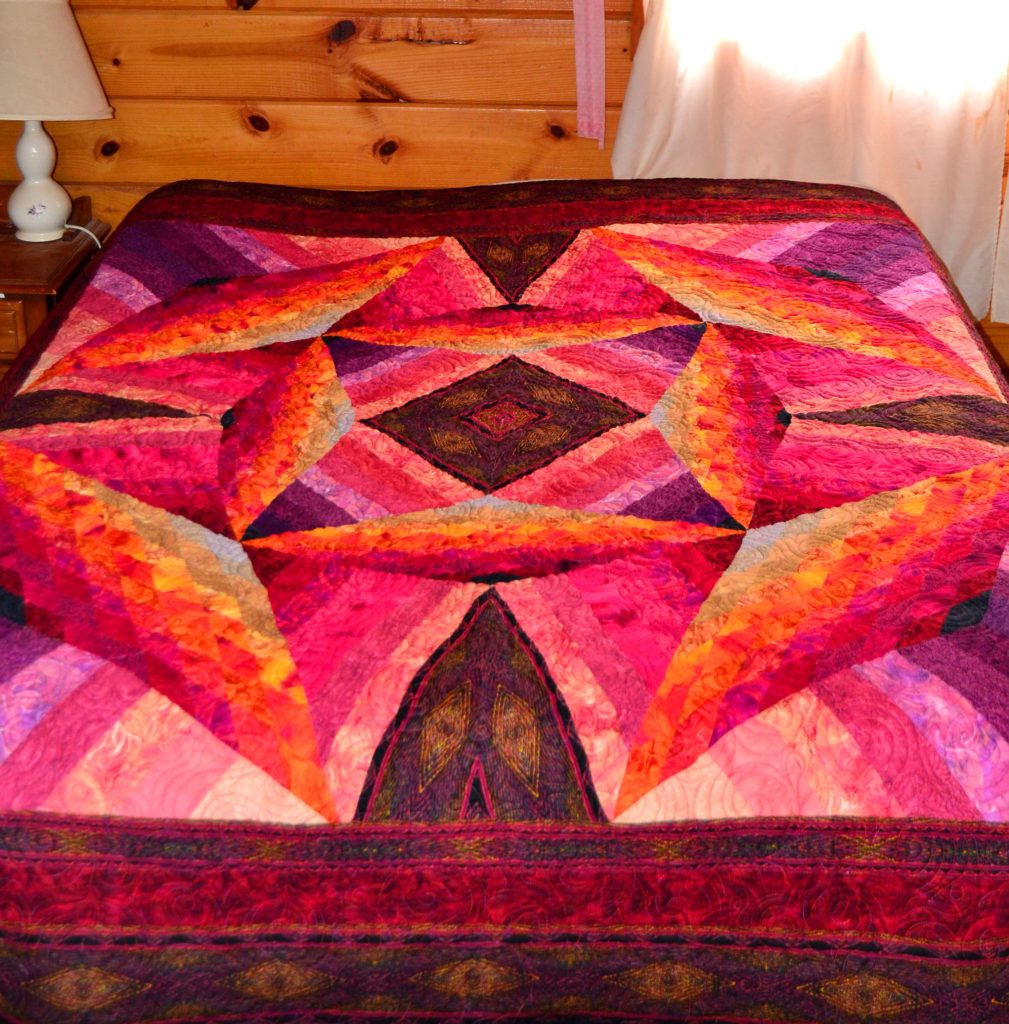
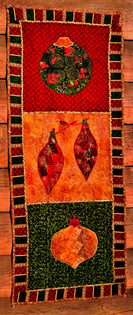
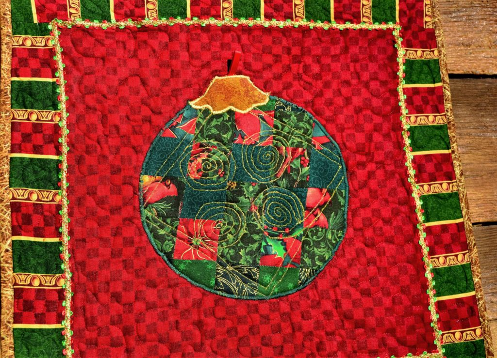
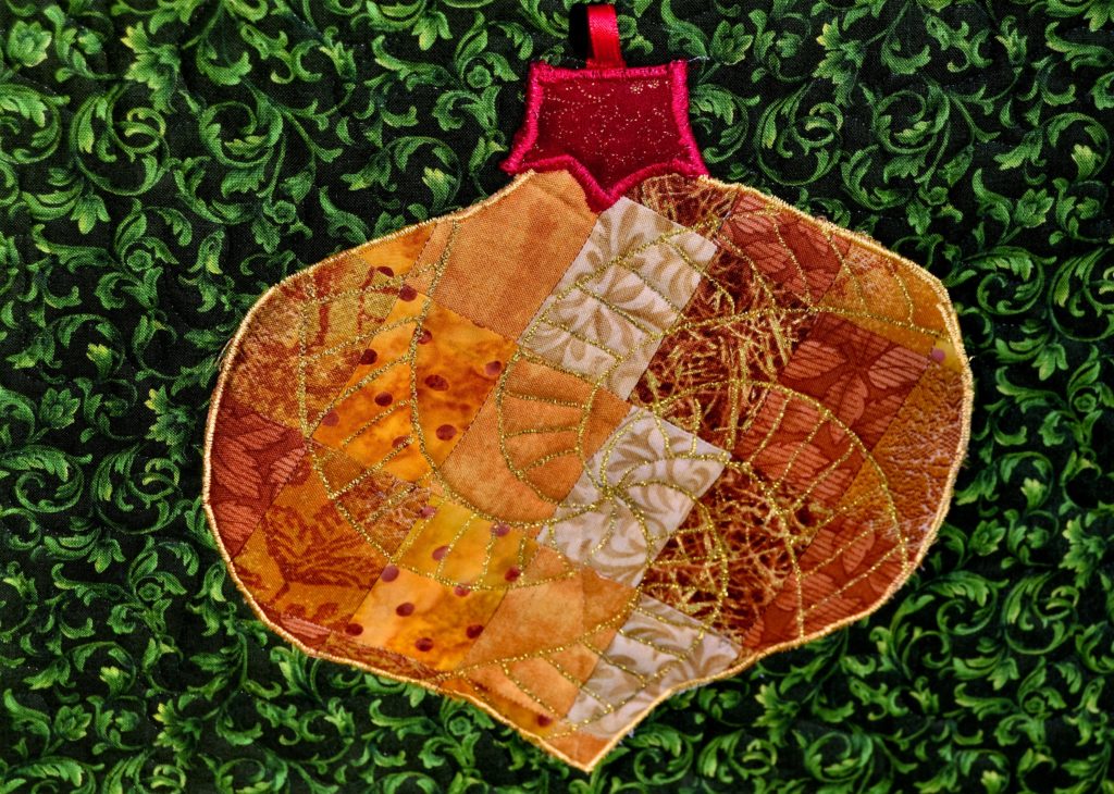
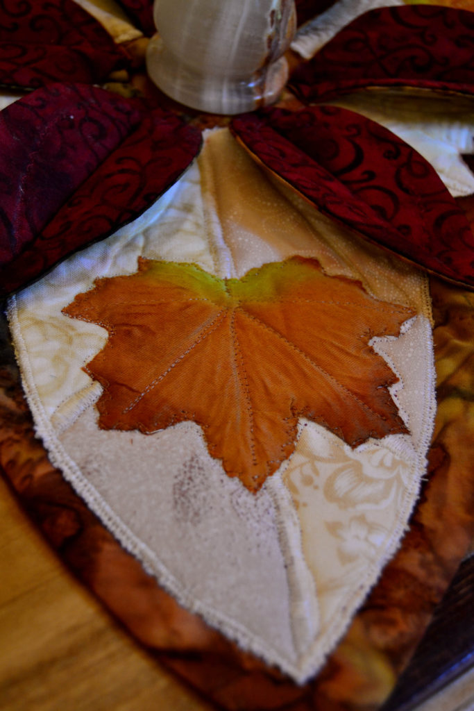
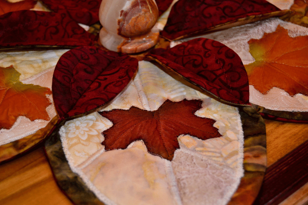
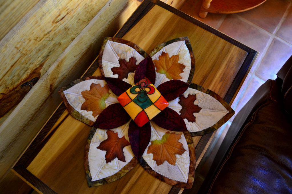
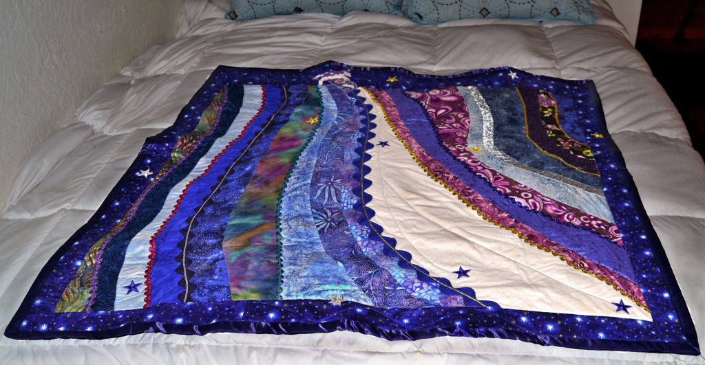
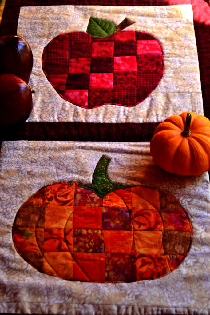
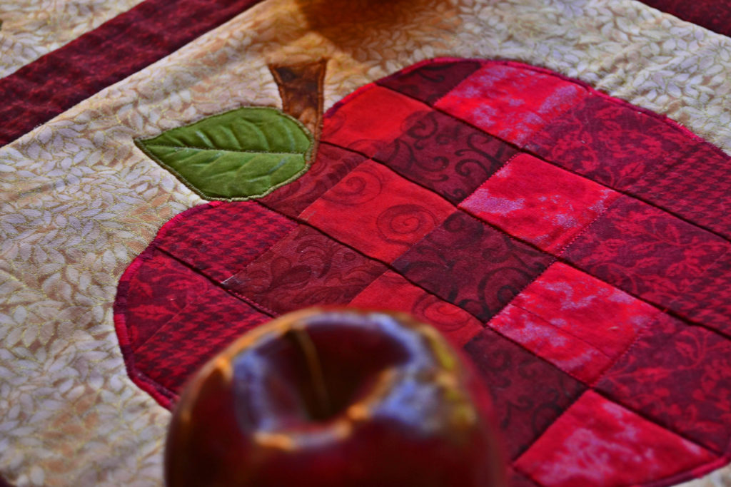
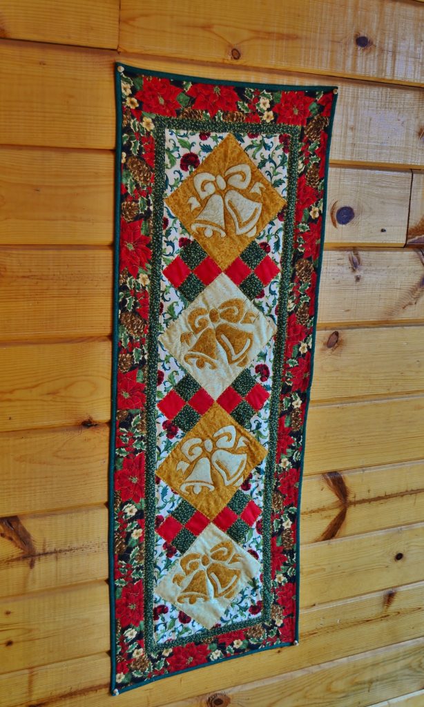
These are the exact same pattern, a Princess YellowBelly original, but the colors are totally different… 
However you go about creating movement with fabric, remember, it’s about the story. You don’t want your quilt to sit there. You want it to move people through the context, to fold in light and shadow, emotion and love.
Next week we’ll finish out this blog series by talking about the other two mediums used in creating movement with fabric art; thread and accessories.
Until then, please consider signing up for our newsletter. It’s quick, easy, and FREE! You’ll receive tips, best products, some personal updates, and more.
