I hope you’re enjoying our series on our creating movement in fabric art. As you may have guessed by now we here at Princess YellowBelly Designs believe in the power of movement. We believe that scenes on a quilt or fabric art panel should move in order to move the viewer. This is the entire basis of creating emotional, artistic fabric art.
In my first article I talked about that principle, and how to understand the theory behind creating movement.
In my second article I talked about how to use your largest medium, fabric, to its best possible advantage. How to mix darks and lights, create shadows, flow, temperatures, etc.
Now we’re on to the last two major mediums: thread and accessories.
The right mix of fabric, thread, and accessories creates a magical story
Plus I’ve tossed in a few other back-up singers into your fabric art movement choir so you can create solid pieces of art all the time.
Creating Movement with Thread
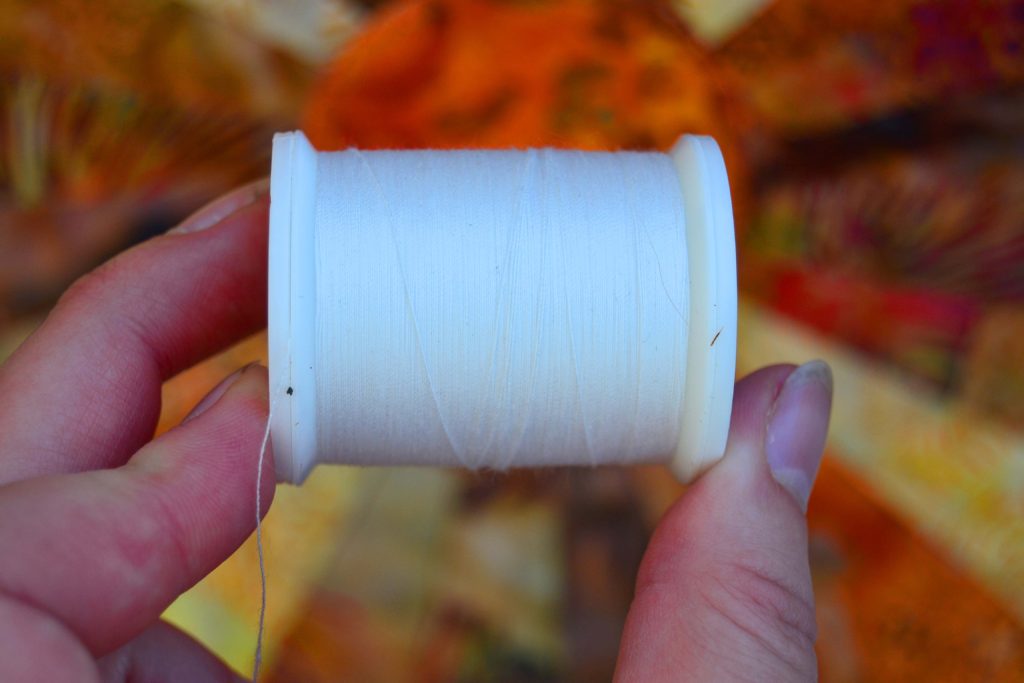
Believe it or not thread creates movement. We’re talking about here are your topstitching, quilting, and appliqueing threads – not the thread you use to sew your seams together. Seaming thread should be beige, 95.5% of the time.
If you don’t know why, don’t worry, we’ve got a whole article about beige thread.
So – which thread do you use to do your highlighting, quilting, or appliqueing? Once again, the answer lies in what you’re hoping to achieve.
Intent Makes all The Difference – Once Again
If you’ve read the first two article on this you know that in order to create art you need a clear vision in mind. If you’re at the part of your project where you’re quilting or topstitching, then you should already have developed a very beautiful and moving project.
And making the right thread choice is usually pretty easy by this stage.
Your fabric art panel will already have specific themes, colors, and moods well developed. And you just need to make some smart choices when choosing which thread to finish the project.
Threads are great at adding a little sparkle or enhancing a certain mood.
Depending upon the project you can use many threads, or only one or two. Just be aware that the larger and more complex your piece is, the more you’ll be changing threads while quilting, appliqueing, and topstitching.
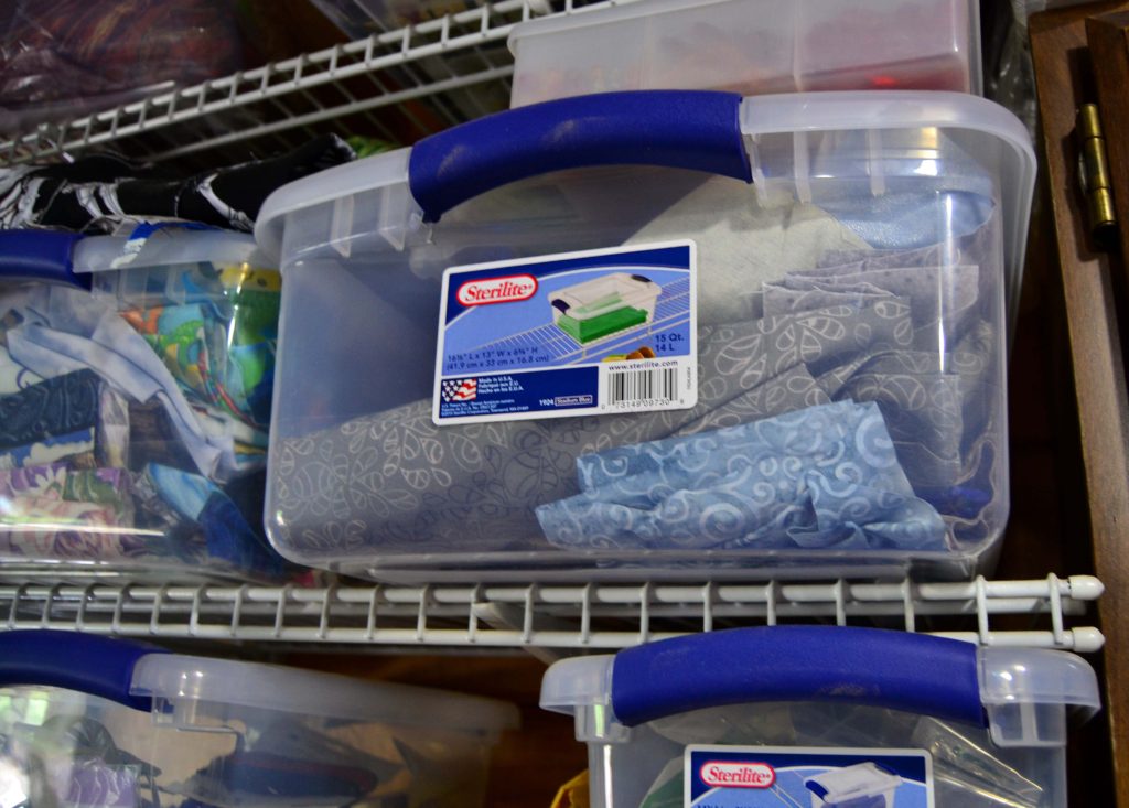
Collecting & Managing Your Thread Options
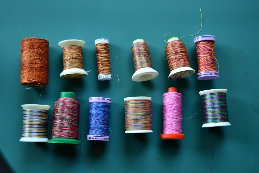
As many fabrics as are available in each and every color under the sun, there are as many different threads. And then we get into the fun threads, such as:
- Variegated thread
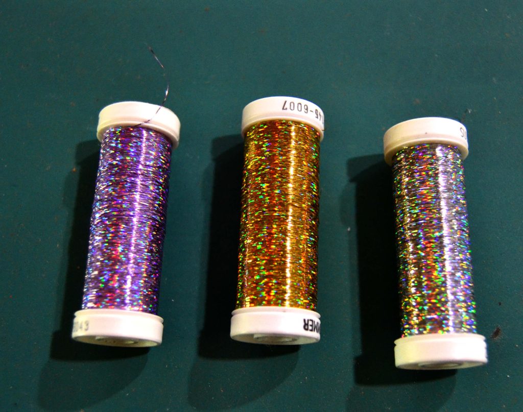
- Metallic thread
- Variegated metallic thread
- Invisible thread
- And now (which is my favorite discovery in a while) glow-in-the-dark thread!
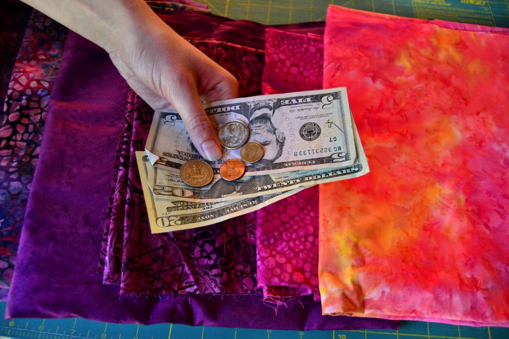
I used to have a few loose spools of thread rolling around in a basket, but as I got more and more into fabric art I found I needed more and more thread colors.
Finally I found a discounted deal on an entire set of quilting thread by Aurofil.
They came in their own plastic container with small spools on one side and large spools in the other. Each ‘color’ has approximately 5 shades and I have used these over and over and over.
I’ve had this set for about 7 years now, and am just starting to use up some of the more popular spools. If this set doesn’t have what I need, I go to my specialty thread box. Naturally this is where you’ll find all the fun threads.
When I’m considering my top-stitching choices I always take a cruise through these boxes and only if there isn’t anything that will work, do I go to the quilt store for something new.
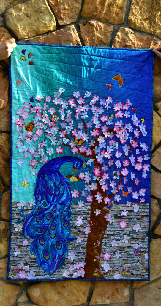
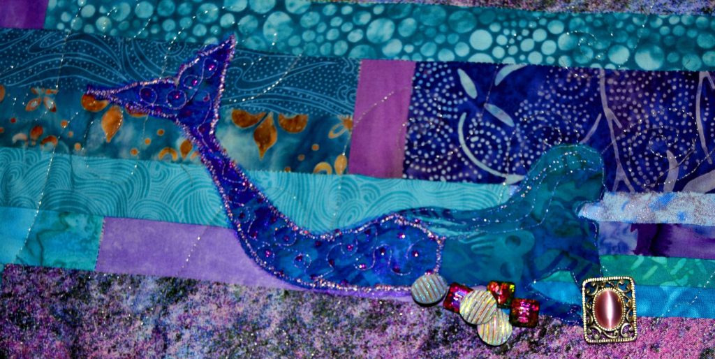
For instance, I used lavender thread for my bobbin when I was stitching my ‘Ocean Maidens’ quilt because my backing fabric was a mottled lavender, grey, green and blue. I completely used up 4 left-over spools of lavender thread and started a 5th before I finished.
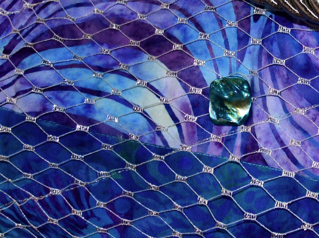
Note: Even though each of these spools was a slightly different shade of lavender, no one will ever be able to tell, and now I have more room in my thread boxes.
Making the Fateful Choice
Now, looking at the options for doing the highlighting and everything for your quilt – these should be your considerations:
Mood
When we were debating thread choices for the Ocean Maiden, Suzanna decided that since mermaids are magical creatures, we needed a magical effect.
To her that meant metallic thread in all its variations, heavy on the silver.
Just between us I got tired of all the thread changes, but she was absolutely right – the end result is shimmery, magical, and adds to the mystery and intrigue of the mermaid.
Popping
If you want a certain design element to simply ‘pop off’ your panel, then use a highly contrasting thread color and stitch it heavily.
This is usually something like a satin stitch.
The wider you make the satin stitch, the more pop it has. This is especially true with variegated thread because the different colors really show up well in this application.
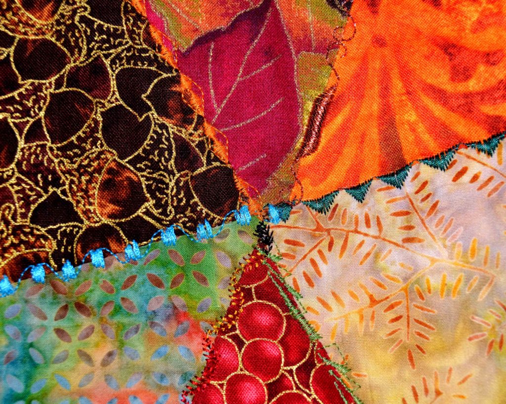
This is also a good technique for metallic thread.
In judicious amounts. A little sparkle goes a long way, especially in a satin stitch, so I typically us a narrow satin stitch with metallic. Also metallic thread does tend to strip and break more than other threads, so you’ve got to decide how much you want to fool with it.
Sparkling
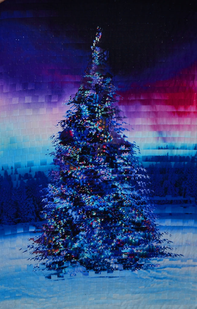
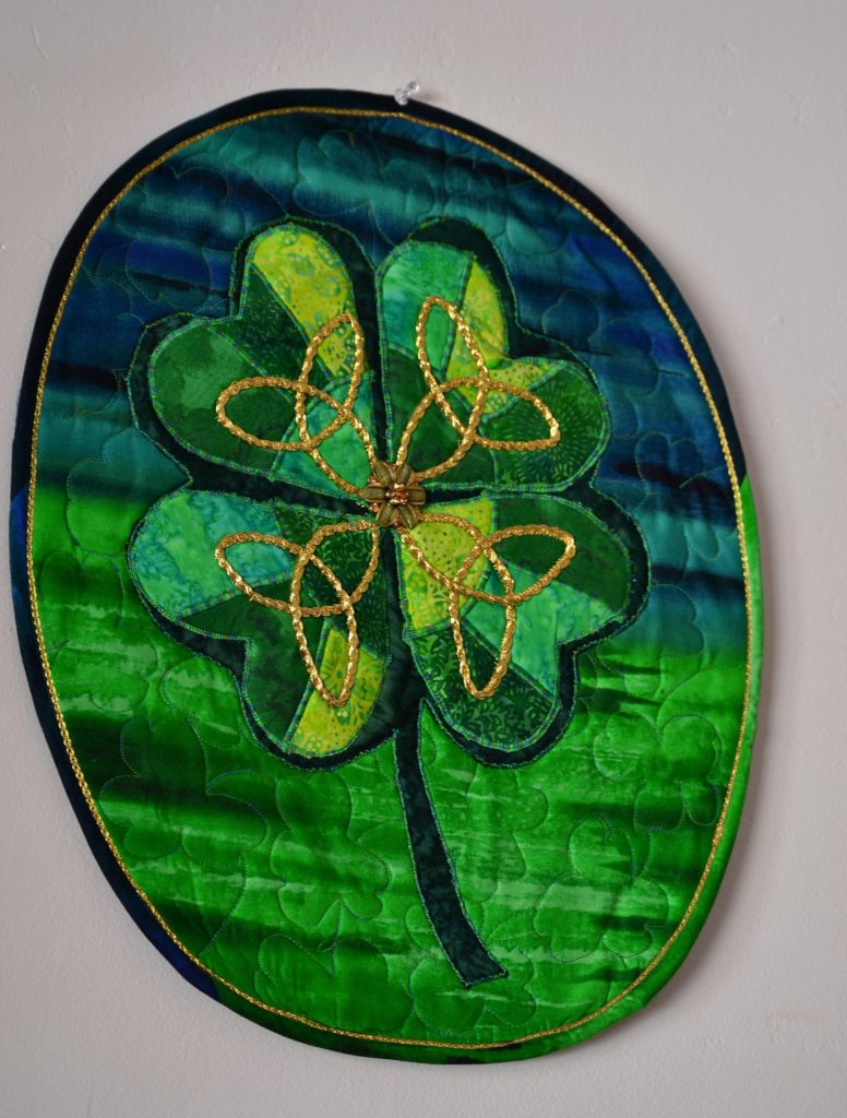
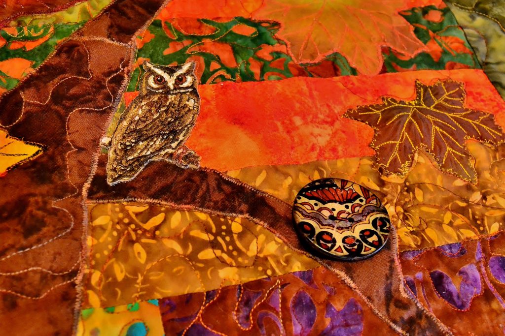
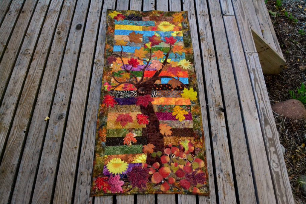
I like to use metallic threads in autumn panels because the bronze and gold go so well with autumn themed fabrics. Also if the sun (gold thread) “shines” on the panel it just lights up.
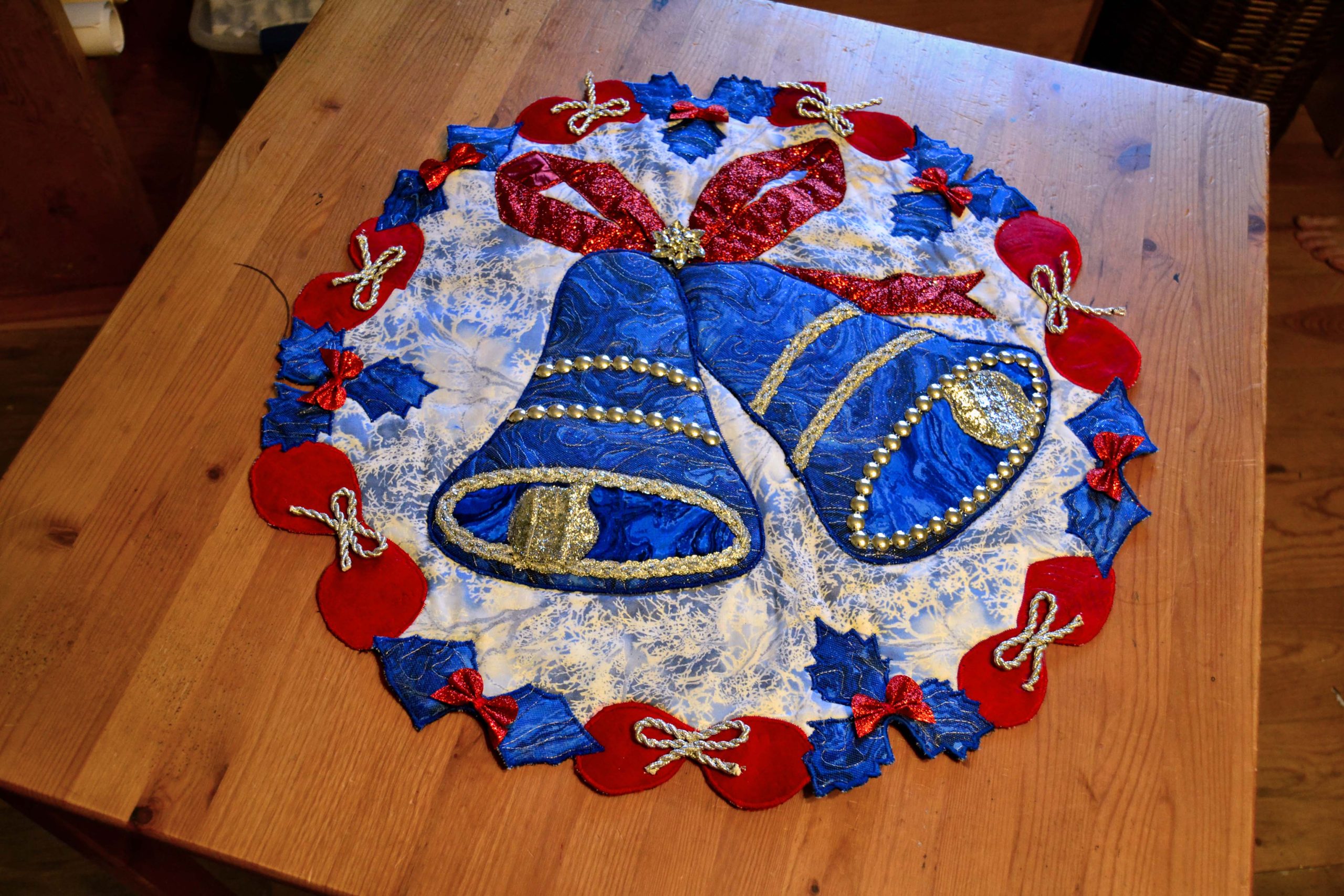
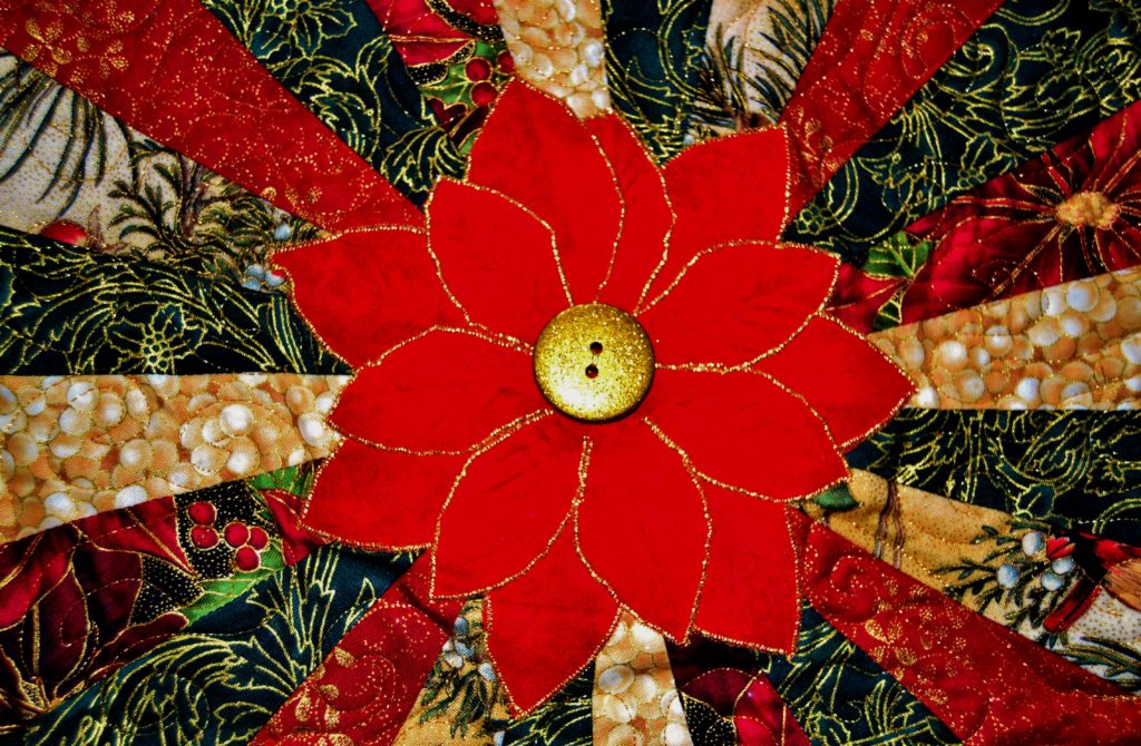
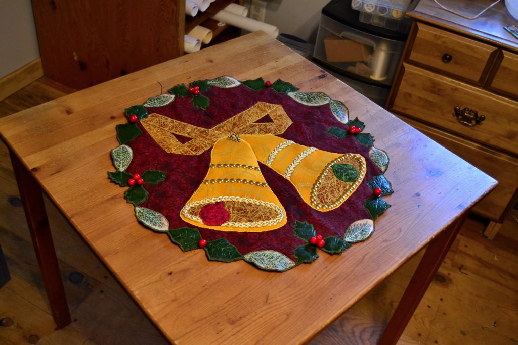
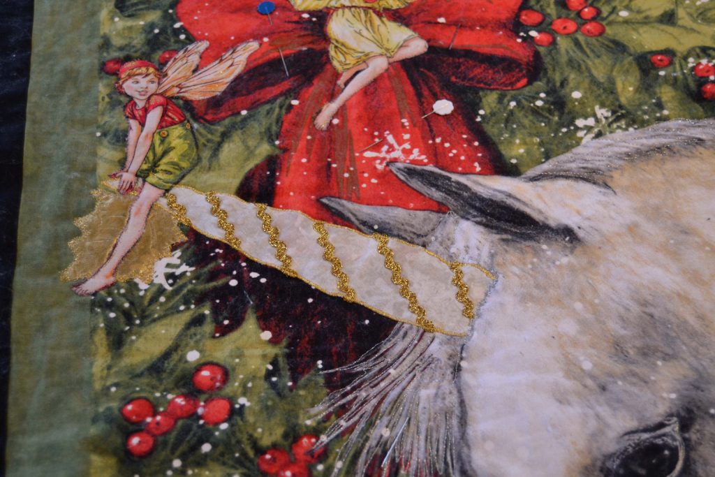
I also like to use silver or gold in projects of a Christmassy nature.

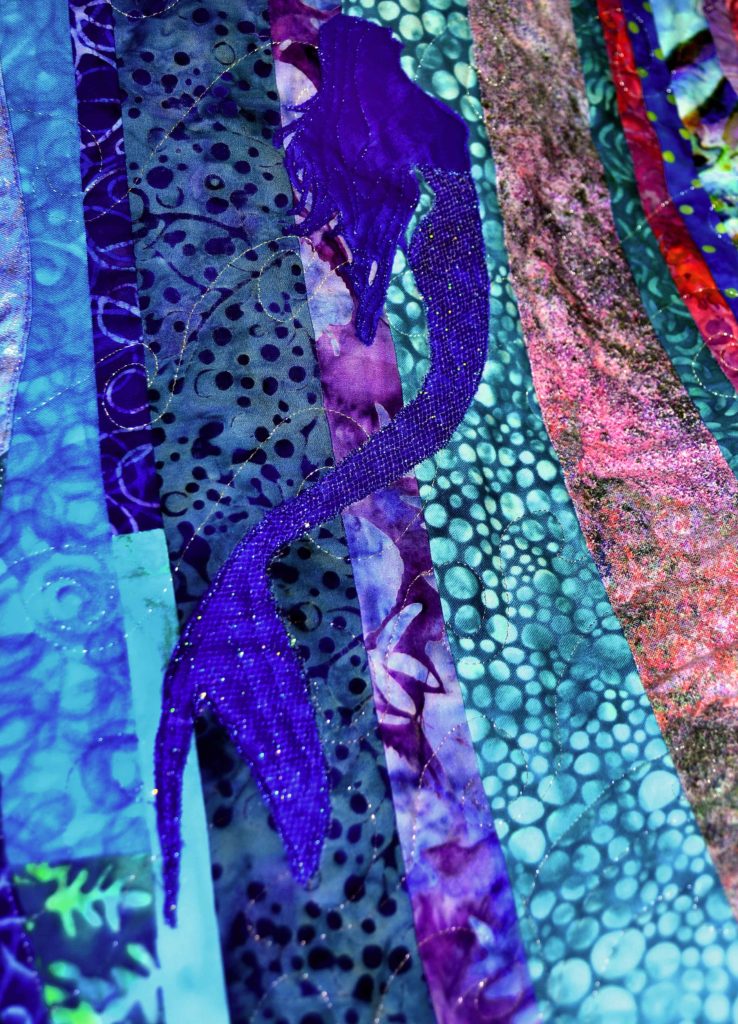
And, like I said, I used a huge amount of silver and lavender metallic thread on my mermaid quilt.
Try to keep a balance with sparkle thread though – a little bling goes a long way. Notice how your eye is drawn to the mermaid tails first – you only notice the rest of her second, and that’s how it should be.
Highlighting
When I want to highlight something I will use a bold color choice – often black – but stitch it with a straight stitch or an open zig-zag. This will draw the eye eventually, but not grab the lion’s share of attention and that’s what highlighting is all about.
Blending
If you want something to just lay there and be quiet, use a color that matches your element and stitch it either with a straight or blanket stitch. Your eye will pass right over it while your brain registers only the movement – and that’s where your movement comes from!
I use beige to top-stitch backgrounds.
How to Use Accessories to Create Movement in Fabric Art
I’ve actually already covered this topic in depth because I love to accessorize so much. So please check out my Bling Blog for ideas on accessorizing your fabric art.
What I just want to point out here is how to use these accessories to move the eye across your project.
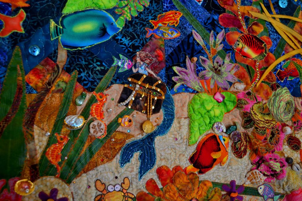
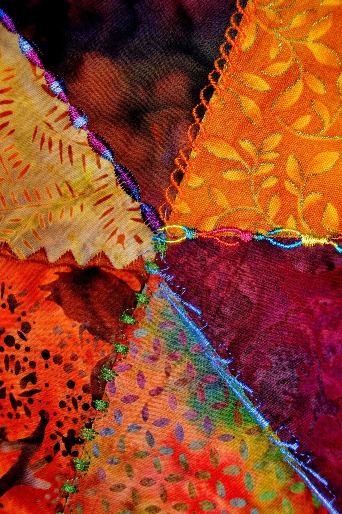
In my Coral Reef Panel, I used long thin, orange-ish leaves that I found in an autumn arrangement at Walmart. I pulled the wire off of the back and then used them to represent sea grass.
When you look at this panel, your eye sees these and follows them along, and this creates directional movement.
Anything that will make your eyes track from one point to the next creates movement.
I also create this effect by:
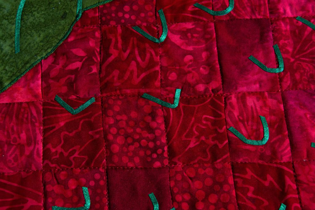
- Sewing buttons or beads on a line
- Ribbons that lead from one element to the next
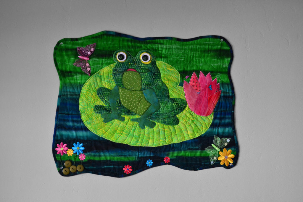
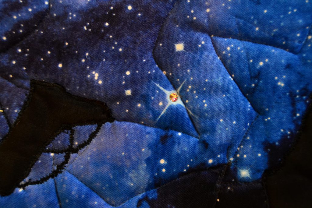
- Crystals that draw the eye to certain elements (I do this for eyes and flower centers)
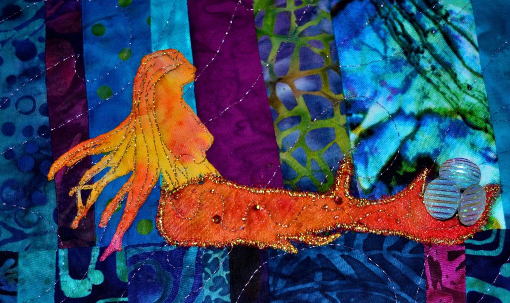
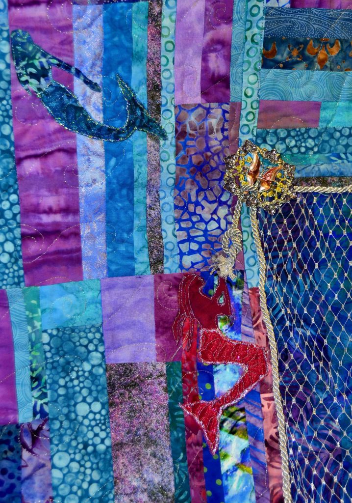
- And in the Ocean Maiden I’m using bubbles to finalize the illusion of movement
Give your imagination free reign when you’re thinking about what accessories will enhance your projects. And keep an open mind when you’re wandering the aisles of stores looking for inspiration.
Accessories are actually one of the few elements I recommend purchasing on a whim. Especially if you shop at antique and thrift stores like I do a certain decorative element will probably be gone the next time, and you’ll never see its kind again.
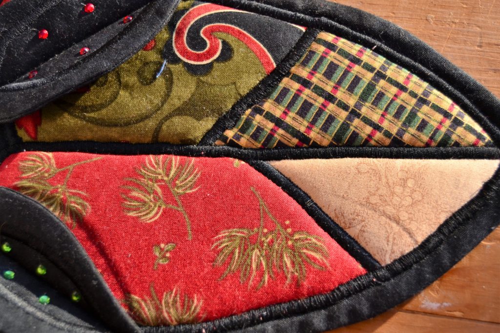
The Most Customizable Accessory – Appliques
This is a French word – you should be able to tell by its weird spelling – for any extra shape that you sew onto the front of your project.
One of my favorite custom-made appliques…ever!
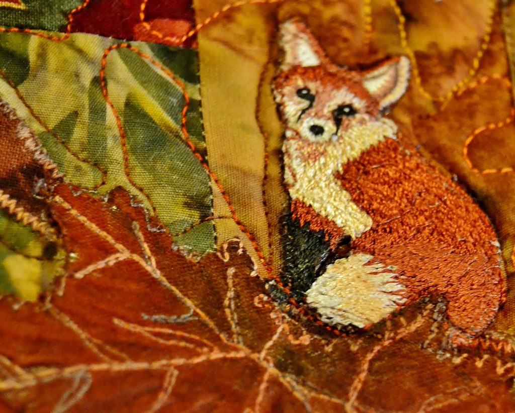
You can buy embroidery appliques in the sewing section of most stores. They are quick and easy to sew on, but they’re not terribly unique or lifelike. If you want anything realistic looking you have to do it yourself.
There’s a relatively easy way to this – check out my Appliqueing with Confidence blog.
What I want to emphasize here is that appliques are one of the most powerful elements you can incorporate into your projects to create movement.
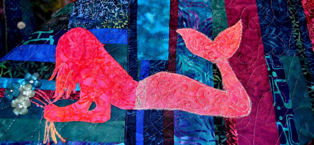
All of the appliqued mermaids in my Ocean Maidens quilt help to keep the eye moving, especially since each one is a different color and shape – sort of- and they’re all engaged in different activities.
When you add an applique it’s like a spotlight has been shone on it – everyone notices it instantly.
Bonus! Back-Up Singers in Your Fabric Art Choir
Wow! I can’t believe we’re almost done with one of my favorite subjects in the whole world.
Still, while we’ve covered the three major mediums that can be used to create movement in fabric art, there are a few more hidden elements that you can take advantage of to increase the impact of your project.
Batting
You can read my blog on batting for all the different choices you have in this area. In short form, your batting choice will help you to emphasize certain elements of your fabric art. There are a multitude of techniques and batting types you can choose, so I definitely recommend giving the whole article a read!
Foam
Think thicker, more emphatic batting. I also have a foam blog, so just hop on over there and read it.
Background Quilting Techniques
I estimate that for about 80% of all my project backgrounds I sew a simple free-motion stipple pattern when I quilt. It’s fast, easy and does a super job of holding everything together. You don’t need a pattern; stippling is simply sewing swoops, lines, and squiggles all over your background without sewing over a previous line of stitching.
Just think of it like dropping a long piece of string onto your project and following along it as it curls and dips.
You can also do spreading ripples, sunrays, and feathers as quilting on your background without a great deal of trouble if you’ve got a free-motion quilting feature on your machine.
Specialty Quilting Patterns
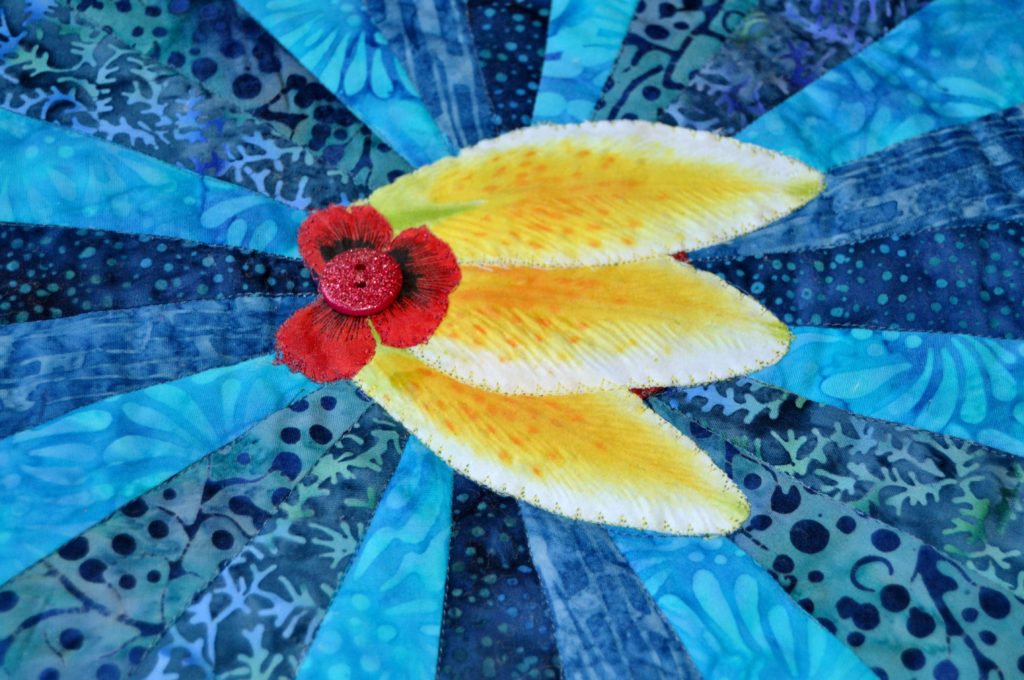
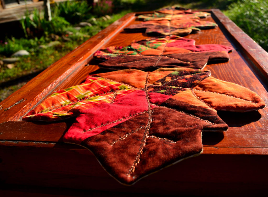
When I want a specific shape to quilt onto my background I use one of my plastic quilting templates and use either my chalk ponce or an erasable pen to trace out the pattern. I did this on my Cassidy Rose quilt and my Starburst quilt.
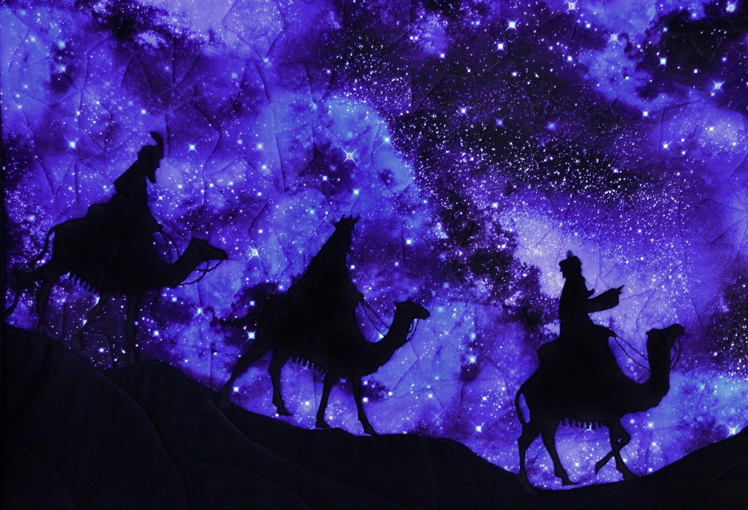
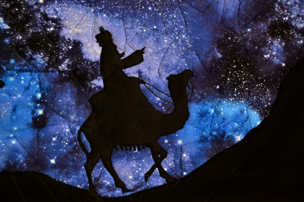
Sometimes, as in my Camel Panel, I use a cookie cutter for the shape I want. A specific shape quilted onto your background, draws the eye (creating movement) and also helps the background to become an integral part of the story – rather than just lying there.
In the Ocean Maiden quilt, I used metallic thread to quilt in rows of a ‘loose’ feather shape to look like waves on my ‘Mermaid Sea” border.
Always think carefully about what you want your background/borders to say or do and then quilt accordingly.
Your fabric art is as unique, beautiful, and vibrant as you are yourself. And the results you can achieve are limited only by your imagination – and the number of times your thread breaks. I hope you enjoyed this series on creating movement in fabric art.
Next week we’ll be back with another great topic.
In the meantime, please consider signing up for our FREE newsletter. It’ll help you stay up-to-date on what’s going on in the world of Princess YellowBelly Designs.
You can also email us with specific questions or comments at karyl@pybdesigns.com. Until next time, all our best!