Some quilters, like me, want to make beautiful quilts without matching points. One of the easiest and best ways to achieve this is by sewing beautiful landscape quilt designs. Landscape quilts are bold, eye-catching, individually unique, and in my opinion a lot easier to sew and quilt than most traditional patterns.
But with these quilts you can’t start in the front – with your snow-capped mountains or your fairies on flowers.
You have to start with the background elements.
A background, by its very definition, is in the back. For most of us this translates as “not as important” or “the very least important part of your quilt.” After all, it’s the main pattern that you want people to notice. That’s where your talent shines.
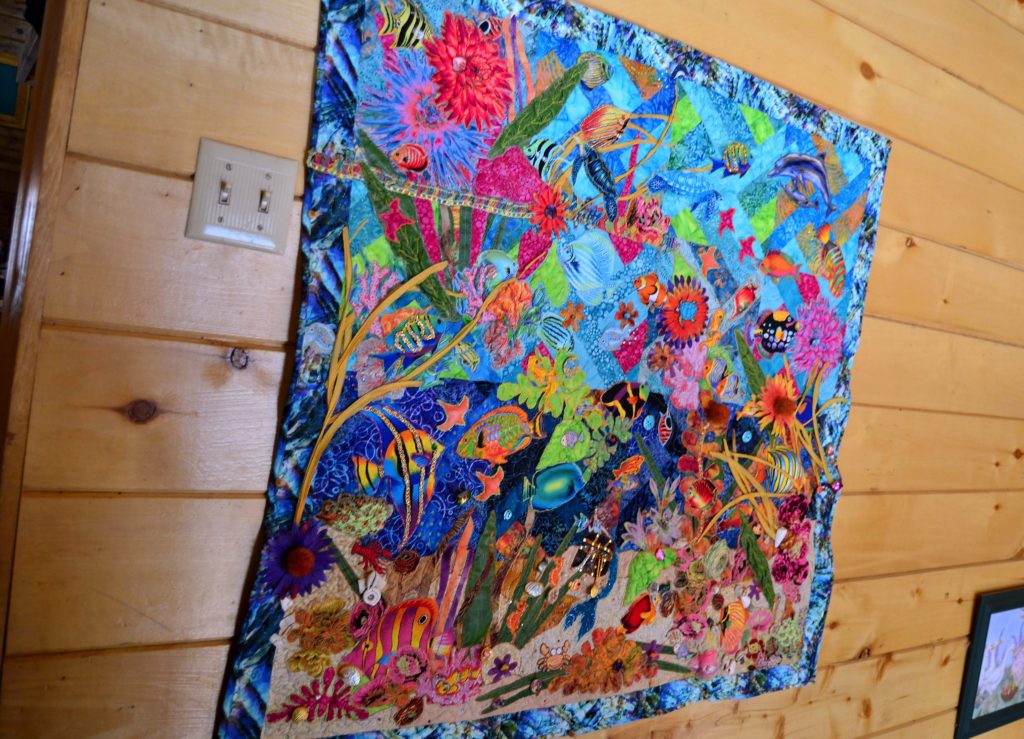
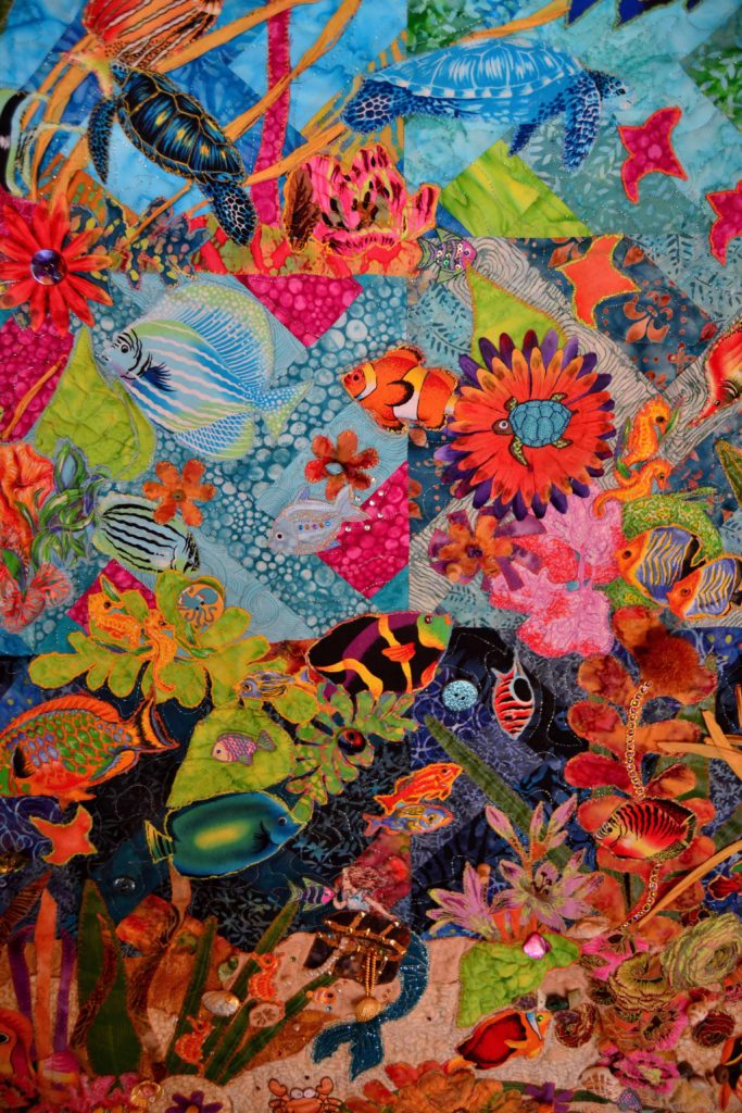
Believe it or not – there’s a series of traditional pinwheel squares behind these colorful fish.
And this is true as far as it goes, but we need to recall that old saying, “Behind every successful businessman is his wife.”
In other words, in any endeavor it’s the hidden, nearly invisible, foundation that has to be built correctly in order for the structure to be of any use. So let’s take a look at how that translates into fabric art.
Backgrounds Matter in Every Quilt – Not Just Landscape Quilt Designs
Although backgrounds are vital to the success of any landscape quilts, and landscape backgrounds can also be a lot of fun, other quilts have background elements that need to be treated with respect in order to work.
- Backgrounds are the biggest areas in quilts and are therefore important.
- If you don’t pick the right background color or pattern, you’ll waste all your time, money and talent because the “front pattern” will not pop out like it should.
I once spent 3 weeks selecting and cutting pieces for a double wedding ring quilt.
My choice was a dark blue that matched the blue in the flower patterned fabric that made the wedding rings – the “front pattern.” After all that, when I sewed the first part together it was awful! Everything vanished and the pattern was totally obscured. So it was back to the drawing board for me.
Understand Quilt Backgrounds
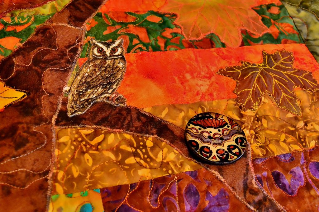
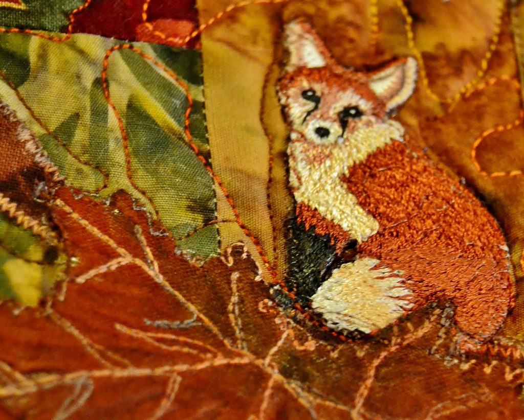
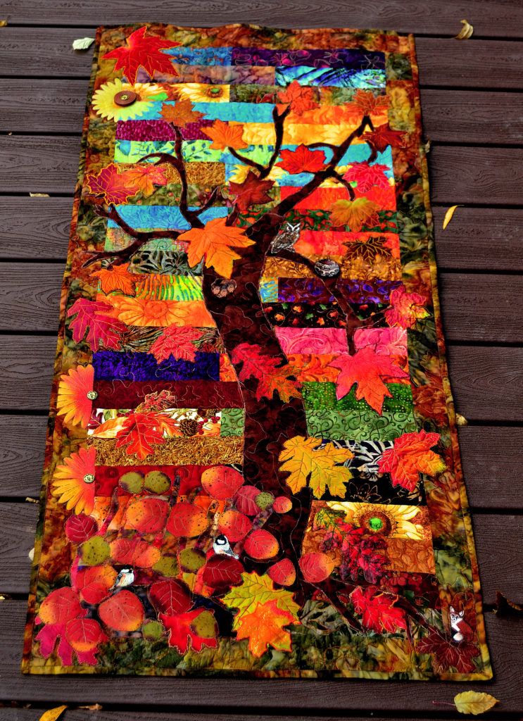
We used a zipper back background on this autumnal wall hanging. The tree trunk cover much of the long-short stripping, but the effect is still to create an abstract, believably blurred out background.
To avoid this kind of waste, here are a few tips that will help you skip past the “learning from your own mistakes” section, straight to the “WOW” section.
Take the time to just think about what you want your project to be and do.
Whether it’s a small wall hanging or a king quilt, everything you make should have a purpose which can vary from keeping you warm, to beautifying your home, to impress, to show love, to tickle your funny bone, etc.
Backgrounds provide one of three functions:
- To fade into the background. In this instance, your background is simply providing the foundation for the real pattern or foreground to live on.
- To focus most of the attention on a single entity in the pattern such as a mermaid, dragon, house, etc. Here the background does not fade out but enhances the foreground.
- To carry the same importance as the foreground. This occurs when your background (as in our Running Wild panel) is the equal to the foreground.
Choosing the Right Fadeout Color
If you want the background in your landscape quilt designs to fade in the overall field of vision a pale, muted color is best – beige comes to mind. Maybe I should call it cream, since it sounds so much more sophisticated!
Seriously, though, look at the fabrics that will make up your main pattern, and you might be able to choose one of the colors in that to use as a background.
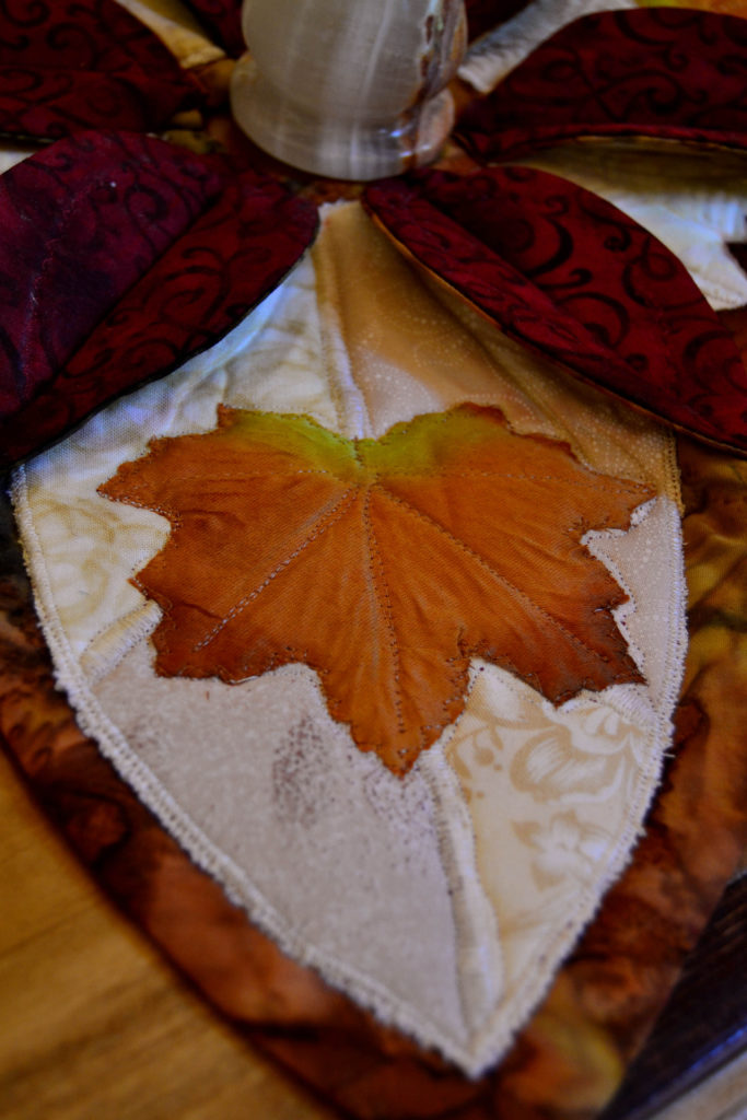
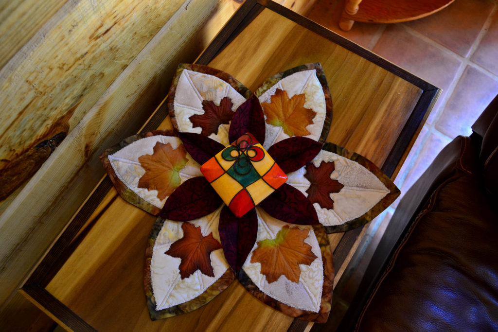
Although it looks like a plain cream background, if you look closely at this example of a landscape quilt design, you’ll notice that there are 4 different cream colors in each “leaf.” 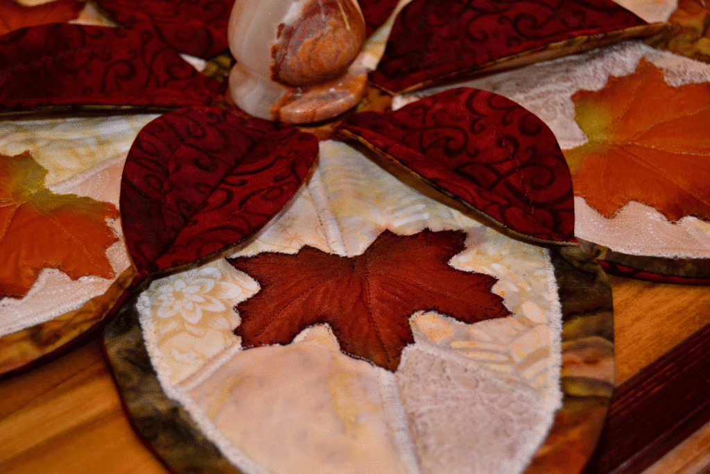
This was the case on my famous/infamous ‘Home Pastures’ quilt. There was a certain shade of blue in each of our three main printed fabric panels. We took those panels to the quilt store, and searched through the entire selection of blue until we found a fabric that picked that shade up – and we used it as the sashing – which can be a type of background in itself.
If the choice doesn’t just jump up and smack you in the face, try this:
- lay out all the fabrics you think might work
- Then lay one piece of your main design on top and see which ones look yucky, okay, good, great, and fantastic. Of course, you want to use the one that looks fantastic.
- If you can’t decide, get another opinion. Michael and Suzanna are both great at this.
Even though your background is the largest part of your quilt, if you pick the right color for it, your eye will see it but your brain won’t. This is also true for strongly contrasting backgrounds – if it’s right, it vanishes under the weight of the overall effect.
Choosing the Right Focusing Color
When the purpose of your background is to focus all of a viewer’s attention on a single entity, you need to think and plan very carefully. Achieving this effect is more a result of purposeful strategy than simply choosing the right color.
This principle is often used in nature photography.
A background, even a very strong background like a mountain, is blurred out in order to focus all the attention on the bird or flower or whatnot.
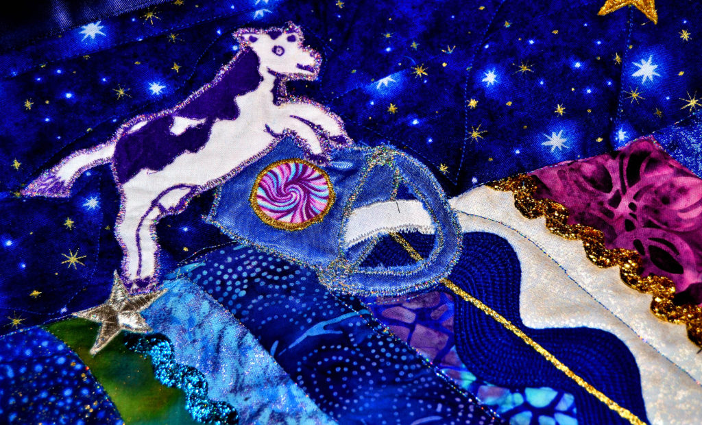
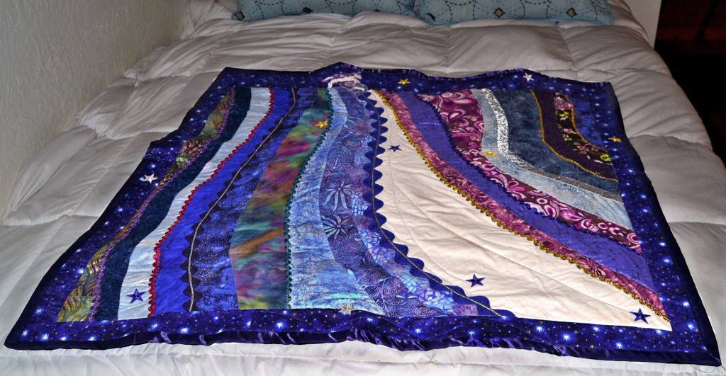
The Milky Way Baby Quilt is at least 93% background, and a layered background at that. But the entire effect is to focus your eye on one tiny applique at the top – the cow jumping over the bucket and the moon.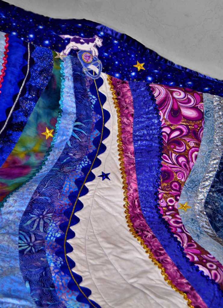
If you look at a Thomas Kinkaid painting, you’ll notice that everything points to one place – usually a house. He achieved that effect with all the background details and his unique use of light.
You can do the same with your fabric art.
Pick out one or two things that you want to focus viewers’ attention on, and then pick images (flora, fauna, water, wildlife, etc.) to enhance that.
Most of the time these types of backgrounds are very busy, like my coral reef panel. In some landscape quilts designs, however, the more austere your background, the better your main image pops.
So it all depends. There are no hard and fast rules here.
Choosing the Right “Backwards Coming Forwards” Color
As crazy as this sounds, sometimes your background needs to be your foreground. This mostly occurs in very strikingly austere quilts such as silhouettes.
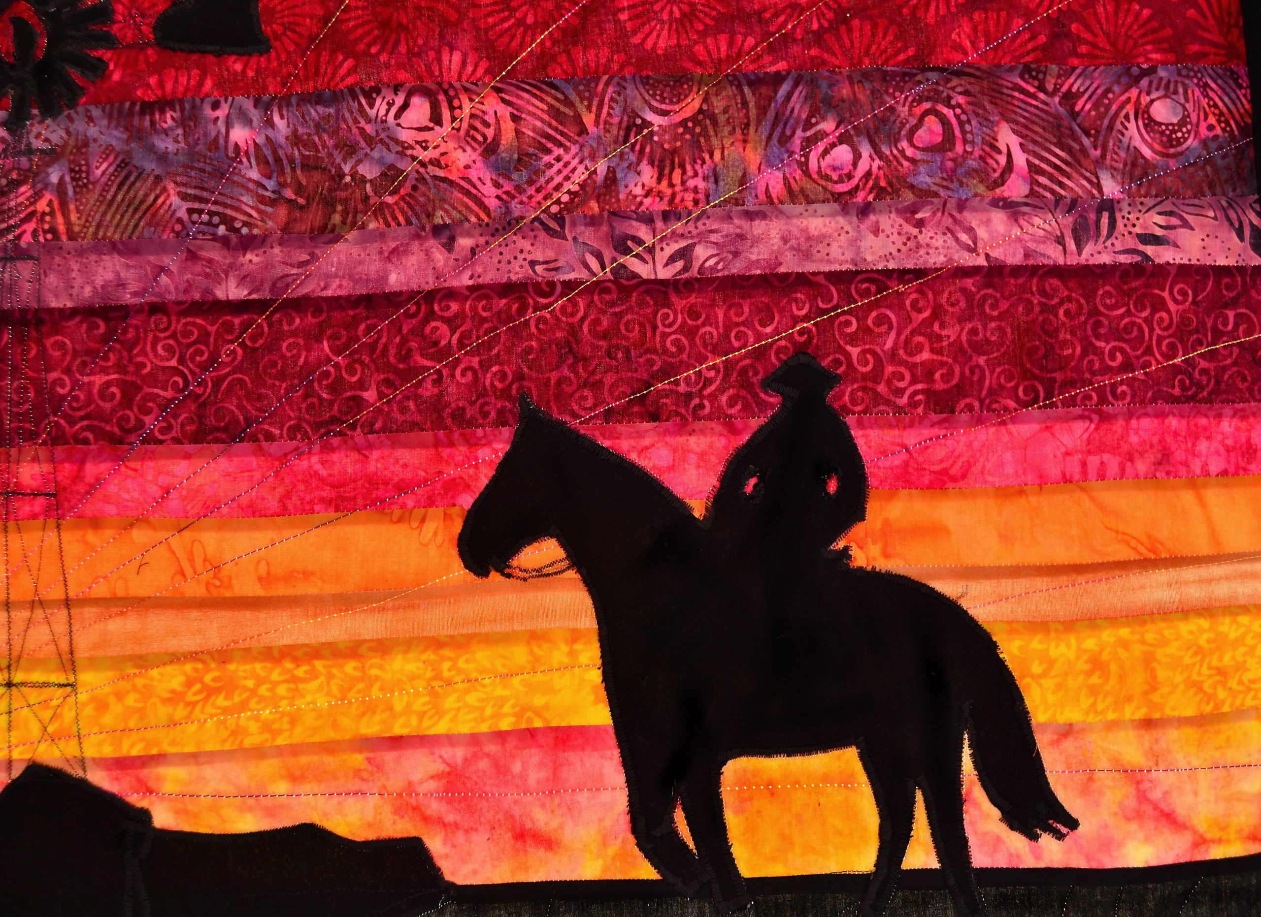
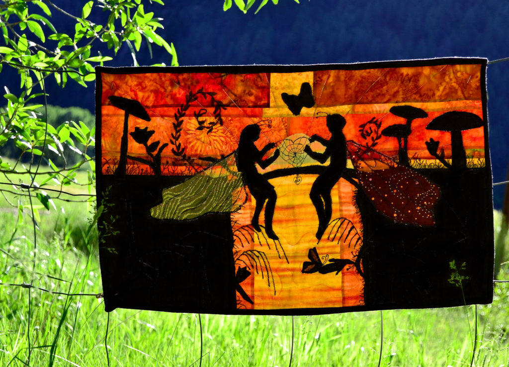
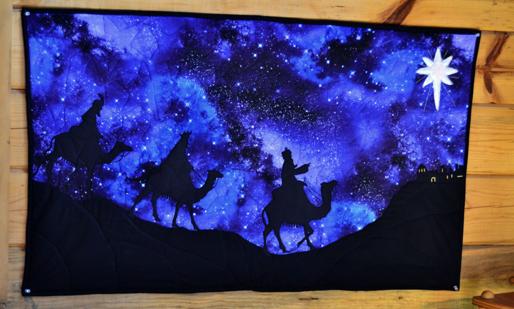
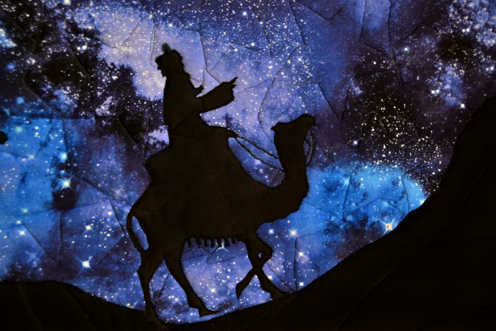
When you make a silhouette, your foreground is one solid color – usually black. In order to make that pop, you need a very striking background. We use this design element in projects such as ‘Running Wild’ & ‘The Cowboy and His Lady.’
The sunset colors in the background are the focal point.
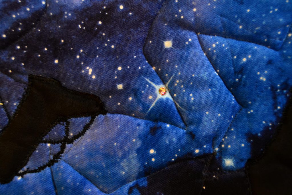
In my Camel Panel, I used a darker constellation fabric for my background, and even though the black silhouetted camels are in the foreground, it’s the night sky that you see first.
Once again, lay out your fabrics, and try different combinations until you’re happy with the look.
A nice side-effect of this type of project is that it’s hard to go wrong. If you have an idea of what effect you want to achieve, and your silhouette is easily recognizable (like a horse) then your background will become stunning pretty easily.
Use the Background to Create Movement in Landscape Quilt Designs
One of the major differences between traditional quilting and fabric art is that quilting creates a pattern, and fabric art creates a picture.
Since we’re interested in the unique and creative, obviously we want our fabric art to do more than just lay there looking impressive with all our point matching exactly.
One of the ways fabric art mirrors reality is by creating movement.
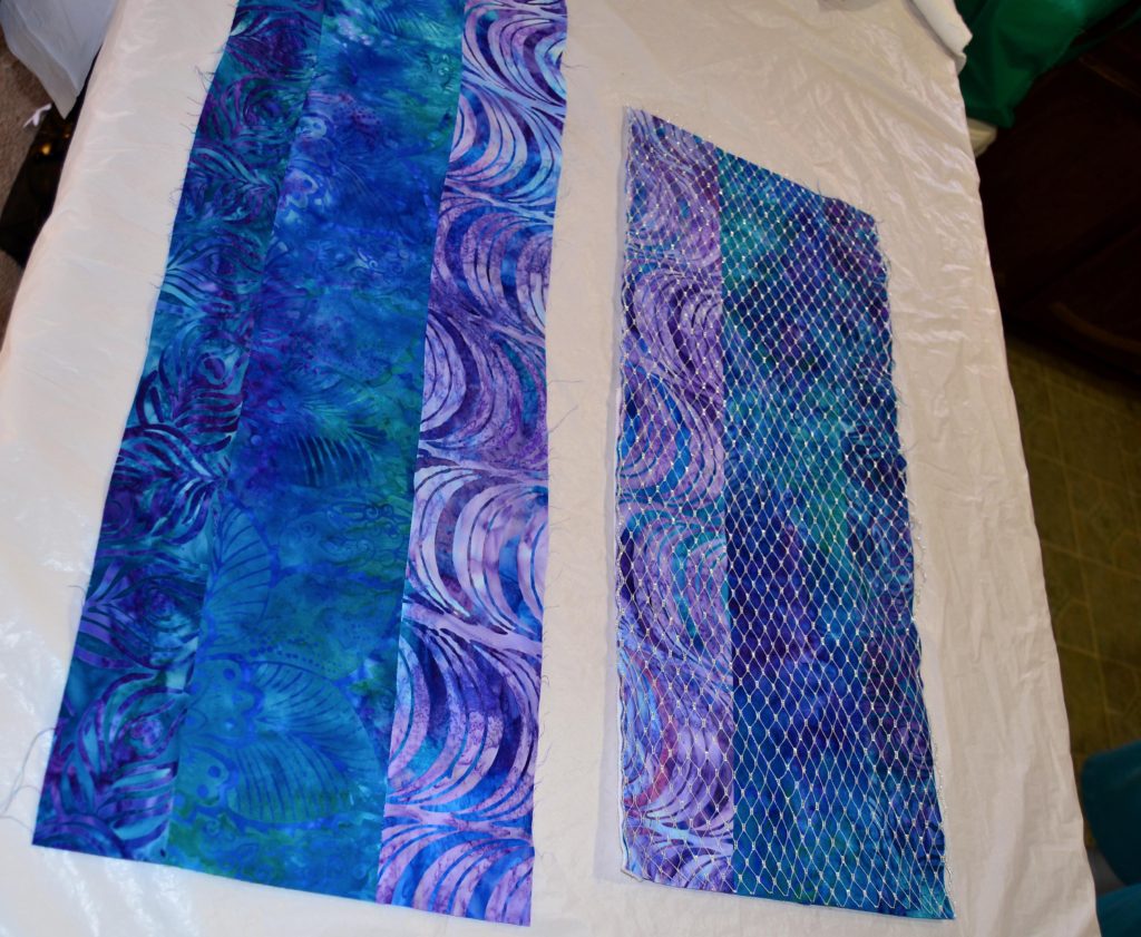
This particular project is still under construction – eventually though these wide borders will be a “tidal pool and silver net” background for the central mermaid panel. 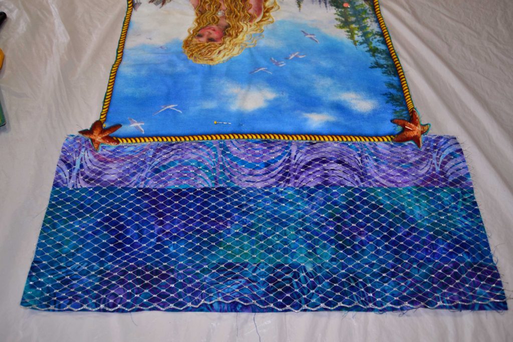
And I’d say that approximately 59% of the movement in a quilt should come from the background elements.
Since we’re talking fabric art here, movement is achieved with fabric and the patterns you put it into. Many quilting patterns naturally mimic movement, and the limit to making them take flight is only your imagination.
Landscape Quilt Designs that Create Movement
A few of my favorite patterns for creating movement in landscape quilting designs are:
- The pinwheel
- Bargello
- Zipper back
- Strip piecing
- And patchwork patterns.
These patterns mimic movement in and of themselves, but when you purposefully design the colors to create one effect, level to level, from the beginning, it really enhances the effect.
My best example of this is my Coral Reef panel.
If you look closely at the background, you will see I used a pinwheel pattern. I constructed 3 levels of these, starting with the darkest down against the sand, then a medium level and lastly a very light level, to convey the impression of moving upwards.
Next, I used one or two of the same fabric in each level (note the lime green) to help draw the eye back and forth.
And even though your eyes may not consciously notice the background here because of all of the stuff happening in the foreground of this panel, your brain notes it and says “water”.
This same technique works just as well for any project and any pattern. Bargello is all about using the same colors in different layers, to draw the eye and create movement.
Pay attention to the fabrics you use in your designs. There are so many different ones out there with circles, swirls, dots, zigzags, starbursts, leaves, bubbles, etc. If you use these in your background patterns they will automatically create movement all by themselves and enhance your illusions exponentially!
As with all fabric art, the creating is the glory, so let your inner genie loose on your backgrounds first!
